I used the Classifier4J Summarizer to summarize the tweets and pick out the 5 tweet summary of the period, and the 1 tweet summary of @ replies and non-directed tweets.
Only letters and spaces were kept for the summary (thus each tweet was treated as one sentence), the summarizer transforms everything to lower case and removes some things like the identifier on bitl.y and other short links.
For this one, I’m having a little fun, really. Essentially I’ve tried to summarize 2 months of Twitter for each user on a slide, hence the inclusion of their pic (as of now, unfortunately not at the time period covered).
Continued on from Part 5, exploring what they are saying using the Phrase Net visualization from Many Eyes.
Each image is a link to the applet where you can explore the text and interact with it. Change the linking word on the left – I’ve used space, but “and” or “is” in particular could be enlightening.
I like this visualization because it shows what goes together. The fact that “globe” and “mail” are linked by “and” is perhaps not unexpected, but what does “Google” link to? News? Facebook? Buzz? What do these link to in turn – privacy? Social networking?
Continued on from Part 4, exploring what they are saying using Word Trees on Many Eyes.
Each image is a link to the applet where you can explore the text and interact with it. Change the word in the top left corner to change the root of the tree.
In which we answer the question – what are they saying?
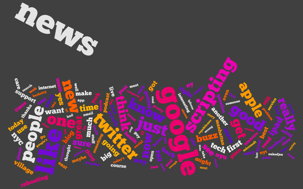
I’ve split the tweets up into two types – at replies, and not at replies, and a third which contains all tweets. I’ve created wordles of each one, for each of the 20 people we were following.
If you haven’t – check out wordle.net. It’s awesome.
There’s debate as to whether wordles are good ways to analyze text – definitely there are better ways (possibly to be explored in a future post) however I think they’re cool and here they have some utility. Note, though, that sizes of word are relative to the number of words in the data set for that individual, which are of varying size (see Part 1, Part 2, Part 3).
I don’t want to tread on Caitlin’s analysis (I’m just the data junkie), but some things you can see, aside from topics of discussion:
People who make a point of thanking others (most likely for retweets or similar)
People who retweet things that others have said about them
Where RT is conspicuous by it’s absence
Specific websites that get tweeted a lot
My personal favorite is Dave Winer’s all tweets! Let me know what you think.
Alex Howard all Tweets
Alex Howard at Replies
Alex Howard not Directed
Alfred Hermida all Tweets
Alfred Hermida at Replies
Alfred Hermida not Directed
Andrew Keen all Tweets
Andrew Keen at Replies
Andrew Keen not Directed
Cody Brown all Tweets
Cody Brown at Replies
Cody Brown not Directed
Dan Gillmor all Tweets
Dan Gillmor at Replies
Dan Gillmor not Directed
Dave Winer all Tweets
Dave Winer at Replies
Dave Winer not Directed
David Cohn all Tweets
David Cohn at Replies
David Cohn not Directed
David Eaves all Tweets
David Eaves at Replies
David Eaves not Directed
Dr. Mark Drapeau all Tweets
Dr. Mark Drapeau at Replies
Dr. Mark Drapeau not Directed
Howard Weaver all Tweets
Howard Weaver at Replies
Howard Weaver not Directed
Jay Rosen all Tweets
Jay Rosen at Replies
Jay Rosen not Directed
JD Lasica all Tweets
JD Lasica at Replies
JD Lasica not Directed
Jeff Jarvis all Tweets
Jeff Jarvis at Replies
Jeff Jarvis not Directed
Jennifer Preston all Tweets
Jennifer Preston at Replies
Jennifer Preston not Directed
Kirk LaPointe all Tweets
Kirk LaPointe at Replies
Kirk LaPointe not Directed
Mark Glaser all Tweets
Mark Glaser at Replies
Mark Glaser not Directed
Mathew Ingram all Tweets
Mathew Ingram at Replies
Mathew Ingram not Directed
Steve Buttry all Tweets
Steve Buttry at Replies
Steve Buttry not Directed
Steve Outing all Tweets
Steve Outing at Replies
Steve Outing not Directed
Steve Yelvington all Tweets
Steve Yelvington at Replies
Steve Yelvington not Directed
Programming-wise, the code is trivial because wordle accepts free text. But, before I realized that the guy who wrote wordle was much smarter than me, I tried to be clever an optimize it by using a LinkedHashSet. I chose this data structure on the basis that – I wanted O(1) random access (the hash) because I would find the same words repeated, only one instance of each word (the set) and a nice quick iteration (the linked) so I could output a key, value table at the end. And then I discovered that there was no get() or elementAt() method – and stopped trying to be a smart-alec!
Continued on from Part 2, I’m representing similar data in a different (less exciting) way.
Before, we looked at how the activity on the twitter streams was spread out over the day and by different types of interaction. Here, I’m using charts to show the breakdown for the day, by user. I’ve also created charts for each type – these are too busy to show much more than users who are way above average in a particular tweet type.
Like last time, something is either:
Directed
Not directed, but containing a mention
Contains a link, not an @ mention
None of the above.
I’m using the existing code I’ve built up – Apache POI to import and some custom data-structures.
Alex Howard
Alfred Hermida
Andrew Keen
Cody Brown
Dan Gillmor
Dave Winer
David Cohn
David Eaves
Directed Tweets: Starting With an @
Dr. Mark Drapeau
Howard Weaver
Jay Rosen
JD Lasica
Jeff Jarvis
Jennifer Preston
Kirk LaPointe
Mark Glaser
Matthew Ingram
Tweets That Do Not Contain an @ Mention Or A Link
Steve Buttry
Steve Outing
Steve Yelvington
Tweets That Contain A Link But No @ Mention
Tweets That Are Not Directed But Contain An @ Mention
Unfortunately, Excel will only plot 250 data points – how unreasonable! Luckily I love breaking Excel and coding something that will do what I want it to do and look prettier, so voila.
Color scheme:
Is directed at someone by starting with an @
Contains a mention (@) of someone else
Contains a link
Otherwise, the point for that tweet is light gray. Note this is done in the order above, so if 1 is true, then it doesn’t matter if both 2 and 3 are true or false – the tweet will be pink. If 2 is true, the tweet may or may not contain a link – it will still be purple.
Alex Howard
Alfred Hermida
Andrew Keen
Cody Brown
Dan Gillmor
Dave Winer
David Cohn
David Eaves
Dr Mark Drapeau
Howard Weaver
Jay Rosen
JD Lasica
Jeff Jarvis
Jennifer Preston
Kirk LaPoint
Mark Glaser
Matthew Ingram
Steve Buttry
Steve Outing
Steve Yelvington
I used the Processing core.jar library within Eclipse, along with the data-structures I created originally and the Apache POI code for extracting the data from Excel.
I’m enclosing the code below, with some comments:
This code will not compile even with the Processing core.jar library (requires data-structure code that I have not yet released).
There is a horrible hack for calculating the time passed since original date – if you’re doing anything more with time consider Joda Time instead.
The code is written to visualize this data and only this data. Whilst I may create a proper ScatterPlot class for Processing at some point, I’ll probably wait until Java 7 because without lambda functions it will require either a standard data format, or some kind of interface hack to create an adapter pattern. I don’t like either of these approaches.
Aside from this, if you have some other use for it feel free to ping me with questions!
package com.catehuston.caitlin.viz;

import java.io.IOException;
import java.util.Calendar;
import java.util.Date;

import com.catehuston.caitlin.datastructures.Tweet;
import com.catehuston.caitlin.datastructures.User;
import com.catehuston.caitlin.parse.UserList;

import processing.core.PApplet;

@SuppressWarnings("serial")
public class Scatterplot extends PApplet {

	private static final int w = 1260; // 1160 for graph
	private static final int h = 600; // 480 for graph

	// spacing at either side
	private static final int xmargin = 70;
	private static final int ymargin = 60;

	// axis length
	private static final int xlen = w-(xmargin*2);
	private static final int ylen = h-(ymargin*2);

	// increments for day, hour, minute
	private static final int di = xlen/58;
	private static final int hi = ylen/24;
	private static final double mi = hi/60d;

	// user we're graphing
	private int index = 5;
	private User user;

	// calendar for date comparison
	Calendar startDate;

	public void setup() {
		UserList ul;
		try {
			// generate user list from spreadsheet
			ul = new UserList("../data/data_june16_top20.xls");
		} catch (IOException e) {
			// TODO Auto-generated catch block
			e.printStackTrace();
			return;
		}

		// get data just for the user we're interested in
		user = ul.get(index);

		// set applet size
		size(w, h);

		// draw() method will be called only once
		noLoop();

		// set up calendar with base date
		startDate = Calendar.getInstance();
		startDate.set(Calendar.YEAR, 2010);
		startDate.set(Calendar.MONTH, Calendar.FEBRUARY);
		startDate.set(Calendar.DAY_OF_MONTH, 1);
		startDate.set(Calendar.HOUR_OF_DAY, 0);
		startDate.set(Calendar.MINUTE, 0);
	}

	public void draw() {
		// set background color - dark grey
		background(64);

		// set foreground color for text and axes - light grey
		stroke(238);
		fill(238);

		// draw user name string top left
		text(user.getUser(), 5, 15);

		// draw x-axis
		int ypos = ylen+ymargin;
		line(xmargin, ypos, xmargin + xlen, ypos);
		// add major markers

		// initial
		line(xmargin, ypos, xmargin, ypos+5);
		text("Feb 1, 2010", xmargin, ypos+20);

		// mid-feb
		int inc = 13*di;
		line(xmargin + inc, ypos, xmargin + inc, ypos+5);
		text("Feb 14, 2010", xmargin + inc, ypos+20);

		// start of march
		inc = 28*di;
		line(xmargin + inc, ypos, xmargin + inc, ypos+5);
		text("Mar 1, 2010", xmargin + inc, ypos+20);

		// mid march
		inc = inc + 14*di;
		line(xmargin + inc, ypos, xmargin + inc, ypos+5);
		text("Mar 15, 2010", xmargin + inc, ypos+20);

		// end of march
		inc = 58*di;
		line(xmargin + inc, ypos, xmargin + inc, ypos+5);
		text("Mar 31, 2010", xmargin + inc - 60, ypos+20);

		// draw y-axis
		line(xmargin, ymargin, xmargin, ypos);
		// add markers
		for (int i = 0; i < 2401; i+=200) {
			inc = i/100*hi;
			ypos = ymargin + ylen - inc;
			line(xmargin-5, ypos, xmargin, ypos);
			String hrs = i + "h";
			if (i == 0) {
				hrs = "0000h";
			}
			else if (i < 1000) {
				hrs = "0" + hrs;
			}
			text(hrs, xmargin-50, ypos+10);
		}

		// go through and plot points, color according to type
		for (Tweet t : user.getTweets()) {
			// set color according to tweet type
			// @ message
			if (t.isDirected()) {
				// pink
				stroke(236, 0, 128);
				fill(236, 0, 128);
			}
			// someone else is mentioned
			else if (t.isMention()) {
				// purple
				stroke(140, 9, 214);
				fill(140, 9, 214);
			}
			// contains link
			else if (t.hasLink()){
				// yellow
				stroke(255, 126, 0);
				fill(255, 126, 0);
			}
			// otherwise
			else {
				stroke(238);
				fill(238);
			}

			Date d = t.getDate();
			int x = getXPos(d);
			int y = getYPos(d);
			ellipse(x, y, 3, 3);
		}
	}

	private int getXPos(Date date) {
		// make calendar with specified date
		Calendar newDate = Calendar.getInstance();
		newDate.setTime(date);

		// count how many days we go back to find start date
		int count = -1;
		while(startDate.before(newDate)) {
			count++;
			newDate.add(Calendar.DATE, -1);
		}

		return xmargin + count * di;
	}

	private int getYPos(Date date) {
		// put date in calendar so we can manipulate it
		Calendar time = Calendar.getInstance();
		time.setTime(date);

		// work out hour increment
		int hrs = time.get(Calendar.HOUR_OF_DAY) * hi;
		// wor out minute increment
		double mins = time.get(Calendar.MINUTE) * mi;

		// return y value
		return (int) (ylen + ymargin - hrs - mins);
	}
}
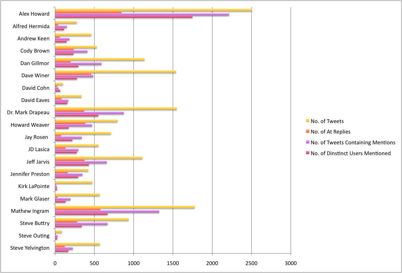
My friend Caitlin is using Twitter to investigate the discourse around the future of newspapers. She has collected a bunch of data in a spreadsheet, and I get to visualize it – yay!
First up, extracting some general stats. I used the Apache POI to get the enormous speadsheet into Java (normally I would use Python for this kind of thing, but because I’ll use Java to visualize later I’m just doing it all in Java). POI made it super easy to do this, literally:
public static List extractTweets(String filename) throws IOException {
	InputStream inp = new FileInputStream(filename);
	HSSFWorkbook wb = new HSSFWorkbook(new POIFSFileSystem(inp));

	List tweets = new LinkedList();
	HSSFSheet sheet = wb.getSheetAt(0);
	for (int i = 0; i <= sheet.getLastRowNum(); i++) {
		HSSFRow row = sheet.getRow(i);
		String name = row.getCell(1).getStringCellValue();
		Date date = row.getCell(2).getDateCellValue();
		String tweet = row.getCell(4).toString();
		Tweet t = new Tweet(name, date, tweet);
		tweets.add(t);
	}

	return tweets;
}
First up, I’ve extracted a couple of overview stats. Specifically: total number of tweets, number of tweets containing @ mentions, number of @ replies, number of distinct users mentioned. You can see what this looks like for the 20 people in the chart, below:
Introduce myself: my name is Cate and I’m a second year Masters student in Computer Science. There’s all these different parts of Computer Science, but how I like to describe myself is that I try to create things that answer the questions that people haven’t thought to ask. What does that mean? Well, you could call me a data-junkie, but I really prefer meaning-junkie.
Credit: iStockPhoto
Let’s talk a little about information overload. Who here suffers from it? Yeah, I do too. And it’s a real problem, but what also interesting is that it’s a recent problem.
Not that long ago, really, the only information humans have came from the Bible. And then the printing press was invented, and the church got really angry about this and tried to stop it.
Of course, they failed. And the amount of information humans had access to increased rapidly. It became worthwhile learning to read! And before too long there was a life-time’s supply of reading material – and more.
Clay Shirky writes about this, and how the internet has brought another such revolution. And again we have the gatekeepers complaining, trying to hold technology back – and failing. And we have more content produced every day, than we can hope to consume in a life-time.
WOW!
And with this volume of content – of information – we have to find ways to draw out the meaning. And that’s what I like to do.
OK, so what has this got to do with Twitter? Well one of the huge changes that Web 2.0 has brought about is that it has changed the way we communicate. Twitter is both a source for sharing and finding information, and a source for conversation. And – a place for conversation about that information. And I know some people think Twitter is completely pointless, but there are many people getting huge amounts of value out of it – because of the simplicity, the flexibility, that I don’t think we can discount it. The diagram is a work in progress, but what it shows is an idea of how the way we communicate, and share, and organize ourselves socially is changing. And people can complain about these developments, and disparage them – but they’re not going away.
Influence
In the old order, we knew who was influential. They were the gatekeepers – the people who controlled the newspapers, or the elected officials, or celebritites.
In this new reality, people who are not gatekeepers can become influential. I’m sure you can think of some great examples.
And, let’s talk about the wider sense of influential. People have always been influenced by their social circle, but now you can have people who you never interact with physically, who are still part of your social circle and still influential to you.
And the gatekeepers, well they have competition. The Breaking News Twitter feed wasn’t created by MSNBC – they were late to this party, they didn’t see that this would be important.
Credit: iStockPhoto
So, what makes someone influential on Twitter? Is it hundreds of followers?
I’m going to say no. I’ve seen spammers with thousands of followers, and if you look a little closer it becomes pretty clear that they are not influencing anyone. So I think that destroys the idea of followers as a measure of influence, at least at the <5000 end of the scale. And even at the higher end of the scale, there was a blog post by Anil Dash saying that being on the suggested user list did not make a significant difference to the number of retweets, clicks, or @ mentions he was getting. Which suggests it doesn’t really apply at the top end of the scale, either.
Really, if someone’s influential then people will be engaging with their content. So most of the influence measures, like Klout, or Twinfluence, consider that – how much is someone being ReTweeted is a key aspect. And then, I think there’s also going to be the aspect who who this influencer is influencing – clearly, influencing other influencers has a bigger impact than just influencing uninfluential people.
Looking at this kind of influence is going to be the topic of my next paper, so these ideas are still evolving, but I’d love to hear what you think about this.
Engagement
Engagement follows influence, because I think that engagement is how those of us who are not famous, become influential. We engage with out network, and share stuff that’s meaningful, and this builds relationships and trust. This trust is crucial. Clay Shirky gave a talk on how the Internet runs on love, but there’s a huge amount of trust there, too. It’s why I follow someone in Google reader – I trust that if they think it’s worth sharing, I’ll think it’s worth reading. It’s how services grow by word of mouth, I get value from Twitter and (some) people trust that if I do, they potentially will as well and it’s worth giving it a try.
There are different levels of engagement, and that’s expressed in this diagram. And what’s interesting to note, is that when we use Twitter (and other services like Twitter) we probably move between all these levels of engagement with people. At the centre, there’s the direct message – because that’s the most intimate (private) form of conversation. We can’t measure this. Then, we have engagement through conversation, or retweets. That we can get through the public API.
Next, is listening, or lurking. That’s when we read, but don’t respond. This is interesting, because how do we quantify this? So yesterday, for example, I put out a link to a blog post I wrote which got two tweets – but 53 clicks. My most popular recent link (to the page where I put my graphs) got 51 tweets and 444 clicks (of the bit.ly link). That suggests there are a lot of people lurking. And this is just a rough quantification of that.
People use lurking as a derogatory term, but I think lurking is crucial to services like Twitter. In this case, lurking is quietly paying attention. Don’t we need people to be doing that to make it work?
The outer circle is ignoring. And whilst we all might retreat to that section from time to time – in order to manage our information overload – only spammers will be there always, pushing their own content but never absorbing other people’s.
Credit: Geek and Poke
This engagement through conversation is quantifiable – we can graph that engagement, get a sense of it using tools that are standard in graph theory. That’s what I’ve been doing, I submitted my first paper recently and it’s called “Following the Conversation: A More Meaningful Expression of Engagement”. Because, let’s think about it, you can write code (or use someone else’s code) to automatically follow and unfollow people until you have thousands of followers – who aren’t listening to a word you say. But you can’t create a conversation like that. You can’t really spam that too well.
Credit: Geek and Poke
If you’re not a spammer, you’re just kinda boring… most likely you’re not getting a huge amount of engagement, either.
Here’s my graph. This is every one who I talk to, and who talks to me, then everyone who they talk to who talks to them. What does it show?
It shows what I’m putting out – people who I’m mentioning, or retweeting. It also shows what I’m getting – who’s retweeting or mentioning me. It also shows those people who I have reciprocal relationships with. Those are the three colors of the links.
And we can start to compare, and we see that people have different graphs. Some are more hectic, some are much smaller. And the level of interconnectedness changes too; some people have very dense graphs, whereas others may have a larger network but it’s more distributed.
Cliques: pulling out the most important part of your network
So these graphs quickly get a little hectic. However, there has been a lot of research into finding cliques within people’s social groups and why that is helpful, and we can do the same here.
So, what’s a clique? A clique is a completely connected sub-graph. So, if I talk to person A and person B, and person A and B also talk, then A, B and I are a clique.
If you were to try and remember all the people you know, it’s likely that you’d do it through chains. So, “Oh, there’s Uncle Bob, and he’s married to Aunt Ann, and they have a daughter…” and so on. So if we graph this, first we’re moving a lot closer to how you think about your network, but secondly we’re picking out what I call your core network – the people to whom you have the strongest ties. And the people who have strong ties to people you’re close to, who may be good recommendations for people to talk to. These are the people connected by the pink connections in the graph.
If we raise the threshold – the minimum size – for the cliques, we get closer and closer to the denser core of the graph. The biggest graphs I’ve seen have been cliques of 8, but they are all on my website – feel free to take a look.
So What?
Some of these graphs are pretty dense, but they are less dense than the follower-following network. Really it’s about pulling out those connections that are sufficiently meaningful to us that we take the time to interact with them. Another study found that this limits out regardless of the number of people we’re following – and it’s a similar story with Facebook. Cliques have been found to be a good way to identify communities on the web, and my current findings are that that is a similar case here.
What Next?
Now, we want to see what people within these cliques are talking about. A lot of what I do is limited by the Twitter API, which limits the number of requests I can make. Now they’ve raised the limits, I want to graph influencers with the same kind of timeframe as regular users (typically around a week) – my current graphs for influencers are over a much shorter time period, for Clay Shirky for example, it was about a day. I’m also going to create graphs of influence networks – just picking out those tweets that look like a retweet.
Next Thursday, I’m giving a talk on my research to people from the communications department. Outline below.
When we talk about how we quantify success in social media (and Twitter), we need to consider how we’re defining engagement. Does someone following us mean that they are engaged with our content? Maybe – but maybe not. We only have to look at spammers with > 1000 followers to see that our current metric for success (number of followers) is severely lacking. I think @ mentions are a far better measure of engagement – it shows people are responding to, and/or retweeting your content.
How can we express this? We can view each @ mention as an edge on a graph, which we can visualize. Whilst our network of followers/following can be massive, typically for a social network (this has been demonstrated on both Facebook and Twitter) the number of people we interact with is just a small fraction of our network. What information can we gain by pulling out this network, and the cliques within it? Potentially it can tell us a lot about engagement, and make some smart suggestions for growing our network, too.
On Twitter? Have you requested a graph yet? Get yours here.
Cookie Consent
We use cookies to improve your experience on our site. By using our site, you consent to cookies.