I’m working on a paper on topical communities, and as part of that I’ve come back to this dataset to explore the social network that emerges through @ mentions.
To start with, I looked at the social network that emerges when we look at the people on the list.
Future of the News Network
This network is pretty densely connected, with the exception of two users on the list. You can see their nodes floating away in the image below:
Future of the News Network – Outliers
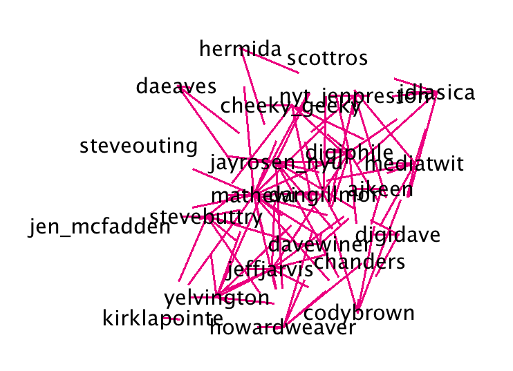
The network graph that emerges from all the tweets connected is really busy, but may show who the most engaged users are.
Future of the News Network – Full
There’s just too much information here, so I started filtering it by eliminating nodes that had fewer than a specified minimum number of connections. Because of the dataset available, non-news-influencer nodes cannot be connected to each other. Thus, I was specifying how many influencers needed to mention a user for them to make it into the graph.
Future of the News Network – Minimum 2
Setting the minimum to two dramatically reduces the size of the graph. Many of the nodes remaining are also well known, for example @jack and @alyssa_milano.
Future of the News Network – Minimum 3
We can also see popular websites, like @techcrunch and @boingboing as well as @google (not surprising given how often google showed up in the earlier visualizations of tweet content.
Future of the News Network – Minimum 4Future of the News Network – Minimum 5Future of the News Network – Minimum 6Future of the News Network – Minimum 7Future of the News Network – Minimum 8Future of the News Network – Minimum 9Future of the News Network – Minimum 10
I find the graphs for minimum 8+ fascinating – I think they start to show who influences the influencers.
Future of the News Network – Minimum 11
Eventually, of course, we get back to our original graph.
Unfortunately I can’t post the actual paper for a year, but hopefully the talk is going to be more interesting anyway! I used Google Docs to create my slides and you can find the deck here.
Twitter: An Overview
Who doesn’t use Twitter? Who doesn’t use Twitter because they think it’s pointless?
Before I start, I want to give a really brief overview of Twitter and how it works so that what follows makes sense.
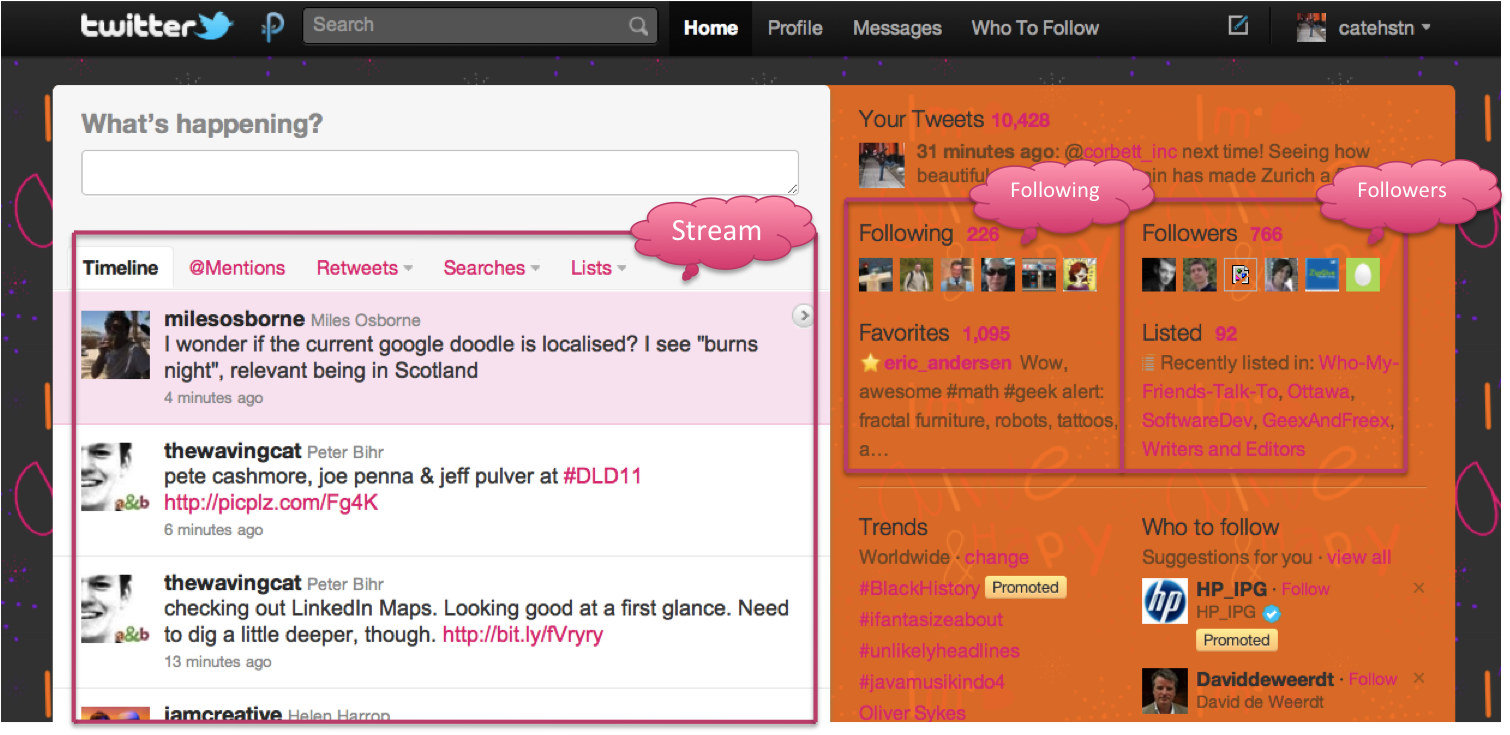
This is the main page that I see on Twitter.com. What I’ve marked as the “stream” is the tweets from the people I “follow” – they’re marked on the right. I follow about 220 people. I’ve also marked out where it shows the people who follow me. I don’t follow all of them back, but it’s important to note that this doesn’t stop them mentioning me, or retweeting me.
On this page, I can see who’s mentioned me or engaged in conversation with me recently (by which I mean, a tweet starting with @catehstn). By selecting that tweet, I can see what (if any) tweet of mine they responded to.
Here I can see the tweets of mine that have been retweeted using Twitter’s relatively recent “retweet” button. Clicking on it, shows me the users who retweeted it.
Finally, these are people I’ve retweeted. Like the last screen, clicking on a tweet shows me who else retweeted it.
Credit: Geek and Poke
People who don’t use Twitter often tell me that Twitter is in fact boring people going on about their tedious lives…
Credit: Geek and Poke
… and in particular sharing with the world what they had for lunch.
It’s funny, because that’s actually why I stopped reading the Facebook news feed.
Anyway, personally I get a lot of value out of Twitter and I think it has and continues to prove it’s value as a medium – with the breaking news about the plane in the Hudson, the Iran election, and every day for businesses as a customer service medium.
Credit: Geek and Poke
It’s hard at first, though, and Twitter can seem a bit like talking to oneself in public. However, it really is what users make of it, which is why I find it particularly interesting. When I showed you the page showing my directed messages, you can see that I can ask a question and people give me sensible answers. And invite me to go skiing. That’s pretty awesome.
People Are Weird
Credit: thisischris.com
danah boyd does amazing research into how people – particularly teens – use social networking service. She posted some examples from her recent field work on her blog, and there were a couple of techniques that teens use to manage their presence on Facebook that are really interesting. Firstly, is deleting everything. Every wall post, every message, is deleted after it’s read and responded to. Status updates are left briefly, then removed as well. Secondly, is deactivating the account every logout, so that interactions can only take place when the teen is online to manage them.
These behaviours are extreme, but to me illustrate why studying people’s behavior in the micro is interesting. At one point, if you sampled an “average” Twitter user, they would have no followers and have never tweeted anything. People use Twitter in really different ways, and the purpose of what we’re doing is to try and capture some patterns that we can pick out to characterize types of users.
Who uses a social networking service – any – in a way that is “weird”? I, for example, read my whole stream. One of my friends tells me I’m completely mad to do that, and I think she get’s frustrated because she’ll start telling me something and I’ll say, “oh I saw that tweet”.
Credit: Michael Weiss
We created this diagram to capture the different levels of interaction users have with one another. At the centre, the direct message, is the most intimate and private form of communication on Twitter. We can’t measure these. Then there are two kinds of active engagement – commenting on content, or conversing (messages that start with an @) and retweeting – when a user shares something they’ve seen with all their followers too. Then there is “listening” – this is reading the tweet, maybe clicking on the link, but not commenting. And finally we have ignoring.
We all move between the different types of interaction types, and our interaction patterns with different users will likely be very different. I definitely converse with people I never retweet, for example! Spammers, though, are always at the outside – they are interested only in pushing their content, not consuming that of other people.
Using Visualization
Credit: geograph.org.uk
So, why do we use visualization? Because we don’t really know what’s going on, exactly, and it’s helpful in looking for patterns.
It’s been shown on Twitter as well as on Facebook that whilst the “declared” set of friends produces a dense graph, the subset of people the user actually interacts with is much smaller and produces a much sparser overall graph. Whilst the number of people we are “friends” with can continue to increase, the number that are interacted with plateaus.
So we started by graphing user’s conversation networks, which is all very well if it’s fairly small like my friend Jen’s…
@jliyi
But get’s harder as it get’s bigger…
@kittenthebad
And eventually all we can really say is that they have a really huge network…
@krusk
… and it’s really very densely connected…
@anitaborg_org
I want to call out this last one, because this is a person, tweeting on behalf and as part of an organization – and she’s produced this crazily connected graph. I see it in my stream, because I see her engaging with people I know, and with myself, but this graph really shows how far reaching it is. I think Twitter’s ability to allow an entity, an organization, to build a community this way is actually quite unique, and really different from Facebook fan pages, for example.
Too Many LINES! What’s Going On?
So it’s hard to draw conclusions once the graphs get of any complexity. It’s really easy to pick out spammers, because they have a lot of out messages and no incoming messages, or just no interaction at all, but beyond that it’s really a question of light/moderate/heavy user characterization.
However the networks have a lot of singly connected nodes, and what we really want to see is the most densely connected core of the graph. We do this using clique finding.
I’m not going to go into the algorithm here, it’s very standard. We use a small optimization to remove nodes with fewer connections than our minimum clique size -1, and that’s it. It’s coded in Haskell, which is fast enough and has enough optimizations that going beyond that actually slowed the running time.
@jliyi cliques size 3+@jliyi cliques size 4+
With Jen, from the cliques and the conversation graph, we can see that she only talks to a few people who also talk to each other. It suggests to me that she mostly uses Twitter to talk to people she knows.
This is me, before I changed my Twitter handle. These images are just snapshots – I know my network now would look very different than it did when I created this, over a year ago. My network is bigger, and I can pull out two key communities that I was involved in, my friends, and the tech community in Ottawa.
Kelly is super-connected, especially within Ottawa. And you see this in her graph, I think, that she’s strongly connected to other people who are very connected. She’s a local influencer, so if you want a message to spread in Ottawa she’s someone who’s very capable of making that happen.
@anitaborg_org cliques size 3+
I love this graph. I see all these disjoint communities relevant to women in technology, that this account is connected to.
In these graphs we can really see the strength and connectivity of the @anitaborg_org network. Why is this important? Because it’s an organization, not an individual. Facebook would have you make a fan page (weird), or “friend” a brand (creepy), but on Twitter the brand can just be part of the conversation. Especially for something like @anitaborg_org, which is about connecting women in tech to each other and driving those opportunities, this is really something that is much harder to do on Facebook or via blogs, if it’s possible at all. Something important to consider, is that the person who manages the account could change, but as long as the new person continued in a similar vein, the community would continue.
Influence
Credit: Geek and Poke
There’s this idea that to be influential, you need a lot of followers. And I really think we’ve moved past that, and most people now know that’s completely meaningless. Influence is about a user’s ability to get people to act. Klout tries to capture that with a number.
They have all these metrics, and people you’re influenced by (and an influencer of), and the topics you’re influential on, but what does the number really mean? I’m less influential than Clay Shirky but more influential than some of my friends?
I think this misses some context. There’s people who you can influence to say, go for dinner (an action in the offline world), and there’s people you can influence to start a conversation, then there are people you can influence to retweet your content. These are all different, and very likely they are around different topics as well.
Let’s talk about Mommy bloggers. Hugely influential – amongst each other. But are they influential to non-mommy bloggers? Are they influential on non-mommy-blogger topics? Can we capture the more nuanced aspects of influence when we just use numbers?
What’s Next?
Future of the News
This is some work that I did with a friend working in Communications – she’s doing a discourse analysis on the future of the news and collected a dataset from Twitter – two months of tweets from a number of users who were deemed influential in this debate. Here I’ve really been chopping up the data in different ways to see if I can help her draw some conclusions from it.
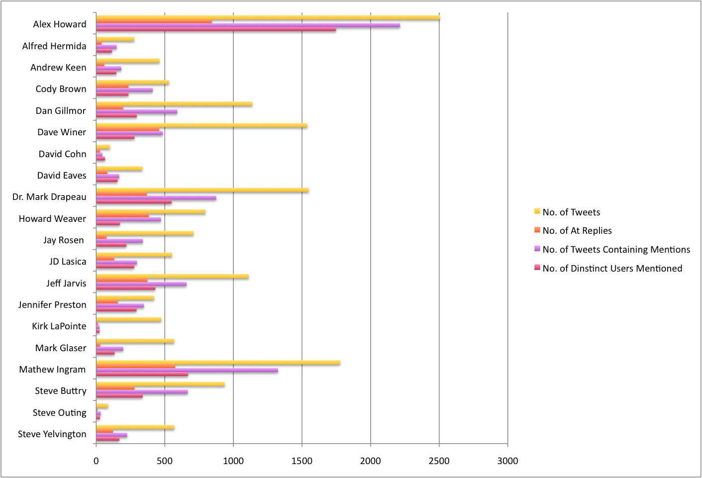
This graph is just a summary of how many tweets and of what kind there are from each user in the dataset.
The key is as follows:
Is directed at someone by starting with an @
Contains a mention (@) of someone else
Contains a link
This is my favorite visualization, because you can see the rhythms of someone’s day. Pale grey tweets are tweets that don’t fall into either of the above three categories, so typical “me-forming” tweets will be grey, as will short opinions. You expect to see some grey tweets, but in particular the user below has a lot:
We also see very few mentions of other users, suggesting that they are not as interactive.
With these graphs, you can see the gap which is nighttime for that user (and so when they are asleep) – but Dave Winer’s is my absolute favourite, because you can see that he pretty much doesn’t sleep!
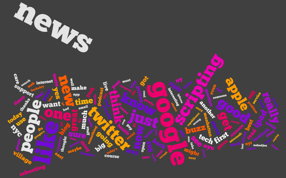
Wordles are not statistically accurate, however I think in the context of this – where really, we’re just looking for things to look for – they’re helpful. We can pick out key topics like “google”, “ipad”, in the one above and below:
We can also see hints of certain behaviors, looking at the blow wordle you can see that the guy below probably retweets people who mention him a lot!
And this guy tweets the same website a lot.
I used some visualizations from Many Eyes for different ways of exploring the text:
For example, we can see what phases follow a certain word, like “news”.
And the other visualization shows the relationship between words.
Exploring a Conference Hashtag
Again, we use a wordle to get a sense of what is being discussed. Eclipe and ESE are the big ones, and whilst we might expect a lot of retweets given the size of “RT” this is skewed by the announcement of a product called “Eclipse RT”. On the left we can also see some influential users in this community – @IanSkerrett for example.
By graphing the frequency of users tweeting X number of times, we can see that the majority of users who participated in tweeting about the conference tweeted just once (with the hashtag), thus a minority of users tweeting up to 26 times with the hashtag are likely to be the ones driving any conversation around the hashtag.
Next, we look at client usage (counted once per user per client, so users with a lot of tweets do not skew the distribution, but use of multiple clients is counted). Despite the open source nature of Eclipse we see a significant number of users on Blackberry, iPhone, and iPad. The web Twitter client is most popular, by some margin.
Here we look at how many clients users used. Note, the users who tweeted only once will of course cause a spike for one, but it was interesting to see that some users use up to five clients.
We can see here that users of the #ese hashtag came from all over the world – the conference was held in Germany.
However the vast majority have their language set to English.
Creating a wordle of user’s bios gives us a sense of how they describe themselves – Software, Java, Developer, and Eclipse stand out.
I find this one of the most interesting graphs, because it shows that the peek for this group of users joining Twitter (not representative of all users, as more technically savvy, lots of programmers/developers etc) happened in early 2009. This is not at all like the trend graph we can get for users searching “twitter” on Google.
Finally, I created networks of the mentions between users – this time there are just two colours, directed (starts with an @) and within, for example a retweet, or a “Great talk by @user on …”.
Lots of the users in the dataset are not connected to this network, but we do see a densely connected core. It seems likely that these people are the ones tweeting more, and are really driving the conversation around the conference.
Summary
People use Twitter in a myriad of different ways.
Visualization allows us to explore patterns and characterize usage.
Clique finding extracts the densely connected network that matters.
How can we use visualization to explore communities on Twitter?
I used the Classifier4J Summarizer to summarize the tweets and pick out the 5 tweet summary of the period, and the 1 tweet summary of @ replies and non-directed tweets.
Only letters and spaces were kept for the summary (thus each tweet was treated as one sentence), the summarizer transforms everything to lower case and removes some things like the identifier on bitl.y and other short links.
For this one, I’m having a little fun, really. Essentially I’ve tried to summarize 2 months of Twitter for each user on a slide, hence the inclusion of their pic (as of now, unfortunately not at the time period covered).
Continued on from Part 5, exploring what they are saying using the Phrase Net visualization from Many Eyes.
Each image is a link to the applet where you can explore the text and interact with it. Change the linking word on the left – I’ve used space, but “and” or “is” in particular could be enlightening.
I like this visualization because it shows what goes together. The fact that “globe” and “mail” are linked by “and” is perhaps not unexpected, but what does “Google” link to? News? Facebook? Buzz? What do these link to in turn – privacy? Social networking?
Continued on from Part 4, exploring what they are saying using Word Trees on Many Eyes.
Each image is a link to the applet where you can explore the text and interact with it. Change the word in the top left corner to change the root of the tree.
In which we answer the question – what are they saying?
I’ve split the tweets up into two types – at replies, and not at replies, and a third which contains all tweets. I’ve created wordles of each one, for each of the 20 people we were following.
If you haven’t – check out wordle.net. It’s awesome.
There’s debate as to whether wordles are good ways to analyze text – definitely there are better ways (possibly to be explored in a future post) however I think they’re cool and here they have some utility. Note, though, that sizes of word are relative to the number of words in the data set for that individual, which are of varying size (see Part 1, Part 2, Part 3).
I don’t want to tread on Caitlin’s analysis (I’m just the data junkie), but some things you can see, aside from topics of discussion:
People who make a point of thanking others (most likely for retweets or similar)
People who retweet things that others have said about them
Where RT is conspicuous by it’s absence
Specific websites that get tweeted a lot
My personal favorite is Dave Winer’s all tweets! Let me know what you think.
Alex Howard all Tweets
Alex Howard at Replies
Alex Howard not Directed
Alfred Hermida all Tweets
Alfred Hermida at Replies
Alfred Hermida not Directed
Andrew Keen all Tweets
Andrew Keen at Replies
Andrew Keen not Directed
Cody Brown all Tweets
Cody Brown at Replies
Cody Brown not Directed
Dan Gillmor all Tweets
Dan Gillmor at Replies
Dan Gillmor not Directed
Dave Winer all Tweets
Dave Winer at Replies
Dave Winer not Directed
David Cohn all Tweets
David Cohn at Replies
David Cohn not Directed
David Eaves all Tweets
David Eaves at Replies
David Eaves not Directed
Dr. Mark Drapeau all Tweets
Dr. Mark Drapeau at Replies
Dr. Mark Drapeau not Directed
Howard Weaver all Tweets
Howard Weaver at Replies
Howard Weaver not Directed
Jay Rosen all Tweets
Jay Rosen at Replies
Jay Rosen not Directed
JD Lasica all Tweets
JD Lasica at Replies
JD Lasica not Directed
Jeff Jarvis all Tweets
Jeff Jarvis at Replies
Jeff Jarvis not Directed
Jennifer Preston all Tweets
Jennifer Preston at Replies
Jennifer Preston not Directed
Kirk LaPointe all Tweets
Kirk LaPointe at Replies
Kirk LaPointe not Directed
Mark Glaser all Tweets
Mark Glaser at Replies
Mark Glaser not Directed
Mathew Ingram all Tweets
Mathew Ingram at Replies
Mathew Ingram not Directed
Steve Buttry all Tweets
Steve Buttry at Replies
Steve Buttry not Directed
Steve Outing all Tweets
Steve Outing at Replies
Steve Outing not Directed
Steve Yelvington all Tweets
Steve Yelvington at Replies
Steve Yelvington not Directed
Programming-wise, the code is trivial because wordle accepts free text. But, before I realized that the guy who wrote wordle was much smarter than me, I tried to be clever an optimize it by using a LinkedHashSet. I chose this data structure on the basis that – I wanted O(1) random access (the hash) because I would find the same words repeated, only one instance of each word (the set) and a nice quick iteration (the linked) so I could output a key, value table at the end. And then I discovered that there was no get() or elementAt() method – and stopped trying to be a smart-alec!
Continued on from Part 2, I’m representing similar data in a different (less exciting) way.
Before, we looked at how the activity on the twitter streams was spread out over the day and by different types of interaction. Here, I’m using charts to show the breakdown for the day, by user. I’ve also created charts for each type – these are too busy to show much more than users who are way above average in a particular tweet type.
Like last time, something is either:
Directed
Not directed, but containing a mention
Contains a link, not an @ mention
None of the above.
I’m using the existing code I’ve built up – Apache POI to import and some custom data-structures.
Alex Howard
Alfred Hermida
Andrew Keen
Cody Brown
Dan Gillmor
Dave Winer
David Cohn
David Eaves
Directed Tweets: Starting With an @
Dr. Mark Drapeau
Howard Weaver
Jay Rosen
JD Lasica
Jeff Jarvis
Jennifer Preston
Kirk LaPointe
Mark Glaser
Matthew Ingram
Tweets That Do Not Contain an @ Mention Or A Link
Steve Buttry
Steve Outing
Steve Yelvington
Tweets That Contain A Link But No @ Mention
Tweets That Are Not Directed But Contain An @ Mention
Unfortunately, Excel will only plot 250 data points – how unreasonable! Luckily I love breaking Excel and coding something that will do what I want it to do and look prettier, so voila.
Color scheme:
Is directed at someone by starting with an @
Contains a mention (@) of someone else
Contains a link
Otherwise, the point for that tweet is light gray. Note this is done in the order above, so if 1 is true, then it doesn’t matter if both 2 and 3 are true or false – the tweet will be pink. If 2 is true, the tweet may or may not contain a link – it will still be purple.
Alex Howard
Alfred Hermida
Andrew Keen
Cody Brown
Dan Gillmor
Dave Winer
David Cohn
David Eaves
Dr Mark Drapeau
Howard Weaver
Jay Rosen
JD Lasica
Jeff Jarvis
Jennifer Preston
Kirk LaPoint
Mark Glaser
Matthew Ingram
Steve Buttry
Steve Outing
Steve Yelvington
I used the Processing core.jar library within Eclipse, along with the data-structures I created originally and the Apache POI code for extracting the data from Excel.
I’m enclosing the code below, with some comments:
This code will not compile even with the Processing core.jar library (requires data-structure code that I have not yet released).
There is a horrible hack for calculating the time passed since original date – if you’re doing anything more with time consider Joda Time instead.
The code is written to visualize this data and only this data. Whilst I may create a proper ScatterPlot class for Processing at some point, I’ll probably wait until Java 7 because without lambda functions it will require either a standard data format, or some kind of interface hack to create an adapter pattern. I don’t like either of these approaches.
Aside from this, if you have some other use for it feel free to ping me with questions!
package com.catehuston.caitlin.viz;

import java.io.IOException;
import java.util.Calendar;
import java.util.Date;

import com.catehuston.caitlin.datastructures.Tweet;
import com.catehuston.caitlin.datastructures.User;
import com.catehuston.caitlin.parse.UserList;

import processing.core.PApplet;

@SuppressWarnings("serial")
public class Scatterplot extends PApplet {

	private static final int w = 1260; // 1160 for graph
	private static final int h = 600; // 480 for graph

	// spacing at either side
	private static final int xmargin = 70;
	private static final int ymargin = 60;

	// axis length
	private static final int xlen = w-(xmargin*2);
	private static final int ylen = h-(ymargin*2);

	// increments for day, hour, minute
	private static final int di = xlen/58;
	private static final int hi = ylen/24;
	private static final double mi = hi/60d;

	// user we're graphing
	private int index = 5;
	private User user;

	// calendar for date comparison
	Calendar startDate;

	public void setup() {
		UserList ul;
		try {
			// generate user list from spreadsheet
			ul = new UserList("../data/data_june16_top20.xls");
		} catch (IOException e) {
			// TODO Auto-generated catch block
			e.printStackTrace();
			return;
		}

		// get data just for the user we're interested in
		user = ul.get(index);

		// set applet size
		size(w, h);

		// draw() method will be called only once
		noLoop();

		// set up calendar with base date
		startDate = Calendar.getInstance();
		startDate.set(Calendar.YEAR, 2010);
		startDate.set(Calendar.MONTH, Calendar.FEBRUARY);
		startDate.set(Calendar.DAY_OF_MONTH, 1);
		startDate.set(Calendar.HOUR_OF_DAY, 0);
		startDate.set(Calendar.MINUTE, 0);
	}

	public void draw() {
		// set background color - dark grey
		background(64);

		// set foreground color for text and axes - light grey
		stroke(238);
		fill(238);

		// draw user name string top left
		text(user.getUser(), 5, 15);

		// draw x-axis
		int ypos = ylen+ymargin;
		line(xmargin, ypos, xmargin + xlen, ypos);
		// add major markers

		// initial
		line(xmargin, ypos, xmargin, ypos+5);
		text("Feb 1, 2010", xmargin, ypos+20);

		// mid-feb
		int inc = 13*di;
		line(xmargin + inc, ypos, xmargin + inc, ypos+5);
		text("Feb 14, 2010", xmargin + inc, ypos+20);

		// start of march
		inc = 28*di;
		line(xmargin + inc, ypos, xmargin + inc, ypos+5);
		text("Mar 1, 2010", xmargin + inc, ypos+20);

		// mid march
		inc = inc + 14*di;
		line(xmargin + inc, ypos, xmargin + inc, ypos+5);
		text("Mar 15, 2010", xmargin + inc, ypos+20);

		// end of march
		inc = 58*di;
		line(xmargin + inc, ypos, xmargin + inc, ypos+5);
		text("Mar 31, 2010", xmargin + inc - 60, ypos+20);

		// draw y-axis
		line(xmargin, ymargin, xmargin, ypos);
		// add markers
		for (int i = 0; i < 2401; i+=200) {
			inc = i/100*hi;
			ypos = ymargin + ylen - inc;
			line(xmargin-5, ypos, xmargin, ypos);
			String hrs = i + "h";
			if (i == 0) {
				hrs = "0000h";
			}
			else if (i < 1000) {
				hrs = "0" + hrs;
			}
			text(hrs, xmargin-50, ypos+10);
		}

		// go through and plot points, color according to type
		for (Tweet t : user.getTweets()) {
			// set color according to tweet type
			// @ message
			if (t.isDirected()) {
				// pink
				stroke(236, 0, 128);
				fill(236, 0, 128);
			}
			// someone else is mentioned
			else if (t.isMention()) {
				// purple
				stroke(140, 9, 214);
				fill(140, 9, 214);
			}
			// contains link
			else if (t.hasLink()){
				// yellow
				stroke(255, 126, 0);
				fill(255, 126, 0);
			}
			// otherwise
			else {
				stroke(238);
				fill(238);
			}

			Date d = t.getDate();
			int x = getXPos(d);
			int y = getYPos(d);
			ellipse(x, y, 3, 3);
		}
	}

	private int getXPos(Date date) {
		// make calendar with specified date
		Calendar newDate = Calendar.getInstance();
		newDate.setTime(date);

		// count how many days we go back to find start date
		int count = -1;
		while(startDate.before(newDate)) {
			count++;
			newDate.add(Calendar.DATE, -1);
		}

		return xmargin + count * di;
	}

	private int getYPos(Date date) {
		// put date in calendar so we can manipulate it
		Calendar time = Calendar.getInstance();
		time.setTime(date);

		// work out hour increment
		int hrs = time.get(Calendar.HOUR_OF_DAY) * hi;
		// wor out minute increment
		double mins = time.get(Calendar.MINUTE) * mi;

		// return y value
		return (int) (ylen + ymargin - hrs - mins);
	}
}
My friend Caitlin is using Twitter to investigate the discourse around the future of newspapers. She has collected a bunch of data in a spreadsheet, and I get to visualize it – yay!
First up, extracting some general stats. I used the Apache POI to get the enormous speadsheet into Java (normally I would use Python for this kind of thing, but because I’ll use Java to visualize later I’m just doing it all in Java). POI made it super easy to do this, literally:
public static List extractTweets(String filename) throws IOException {
	InputStream inp = new FileInputStream(filename);
	HSSFWorkbook wb = new HSSFWorkbook(new POIFSFileSystem(inp));

	List tweets = new LinkedList();
	HSSFSheet sheet = wb.getSheetAt(0);
	for (int i = 0; i <= sheet.getLastRowNum(); i++) {
		HSSFRow row = sheet.getRow(i);
		String name = row.getCell(1).getStringCellValue();
		Date date = row.getCell(2).getDateCellValue();
		String tweet = row.getCell(4).toString();
		Tweet t = new Tweet(name, date, tweet);
		tweets.add(t);
	}

	return tweets;
}
First up, I’ve extracted a couple of overview stats. Specifically: total number of tweets, number of tweets containing @ mentions, number of @ replies, number of distinct users mentioned. You can see what this looks like for the 20 people in the chart, below:
More to come!
Cookie Consent
We use cookies to improve your experience on our site. By using our site, you consent to cookies.