Visualization
-
Spammers etc.
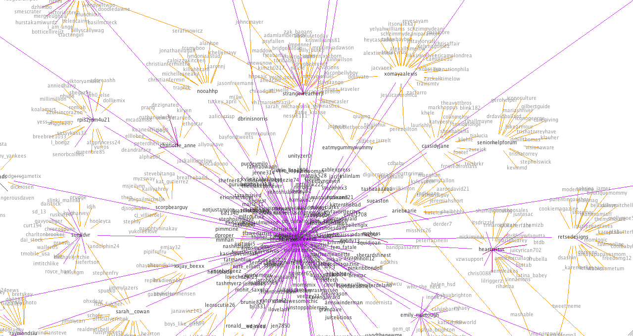
→: Spammers etc.I got another irrelevant @ message. The content of this one was a link to … you knew where I was going with that. I don’t need to say it! Check out the graph for the originator – @BaileyWolfeaem: Again, lots of one way links to “normal” Twitter uses (who have reciprocal conversations). the graph…
-
@ Message Spam
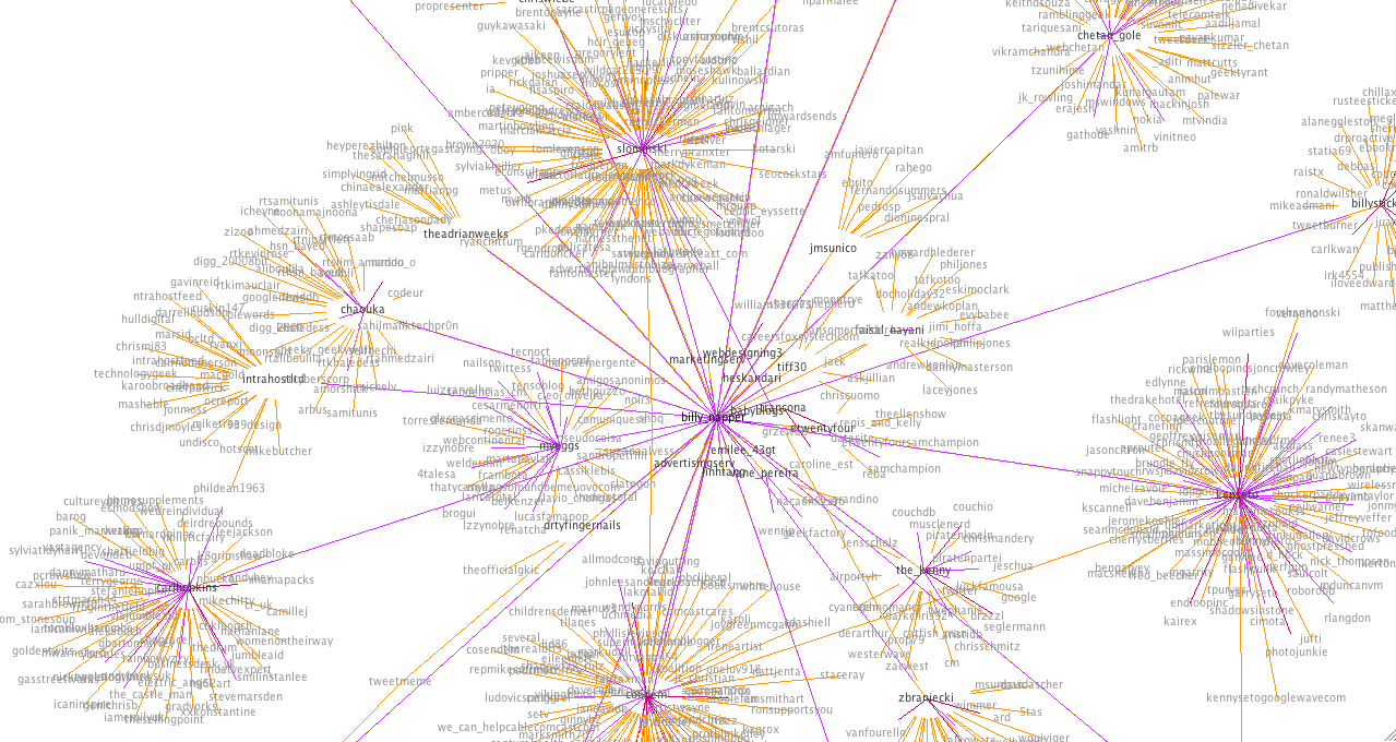
→: @ Message SpamI used Twitter’s new “Report as Spam” feature today for the first time, after I got a bizarre @ message from @billy_Napper_ (Following 0, 0 Followers) about the top 10 hosting sites. I don’t pretend to know all the different kinds of spam on Twitter, but there are those spammers that follow you in order…
-
What Constitutes Spam on Twitter?
→: What Constitutes Spam on Twitter?I don’t know if this is particularly harsh, but I consider anyone who regularly promotes the same website without declaring an affiliation to be a spammer. Sometimes a well-disguised spammer, kudos to that, but a spammer nevertheless. Note – this doesn’t include people promoting their blog on Twitter. I tweet posts from my blog that…
-
Twitter Graphs…cont
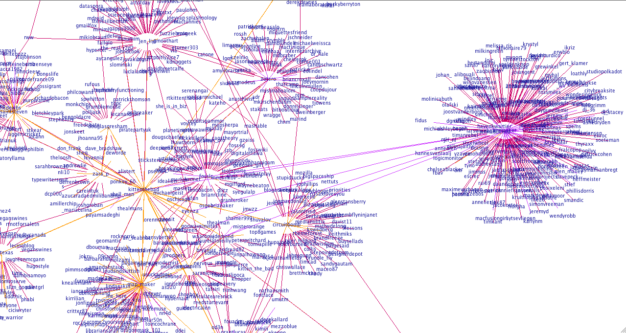
→: Twitter Graphs…cont@RebekahHarriman: @RossIGrant: @ponkey_60 – this one is interesting because usually she protects her tweets. She unprotected them for me so I could create the graph. I wonder if people with protected tweets typically have smaller networks? @douglasgresham: @tgrevatt is having a lot of conversations!! With a lot of people who have a lot of conversations.…
-
Do Twitter Scammers Have Conversations?
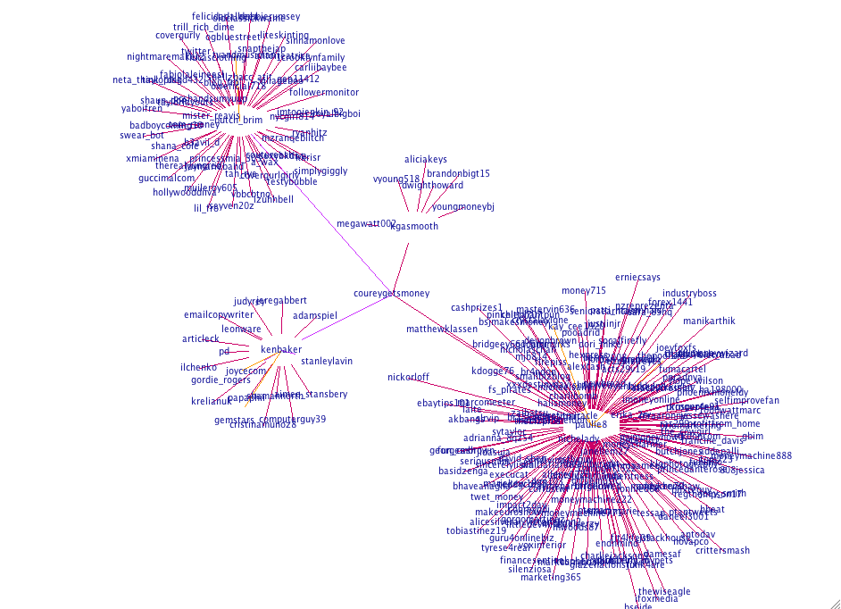
→: Do Twitter Scammers Have Conversations?I’d like to say a big thankyou to @CoureyGetsMoney for following me (3,109 Following 2,831 Followers). His bio reads: Thanks for checking out my page im a real cool guy making 12,000 a month working from home with GDI I suspect he’s lying about his income and about being a “real cool guy”. I also…
-
Visualizing your Twitter Conversations: Rationale
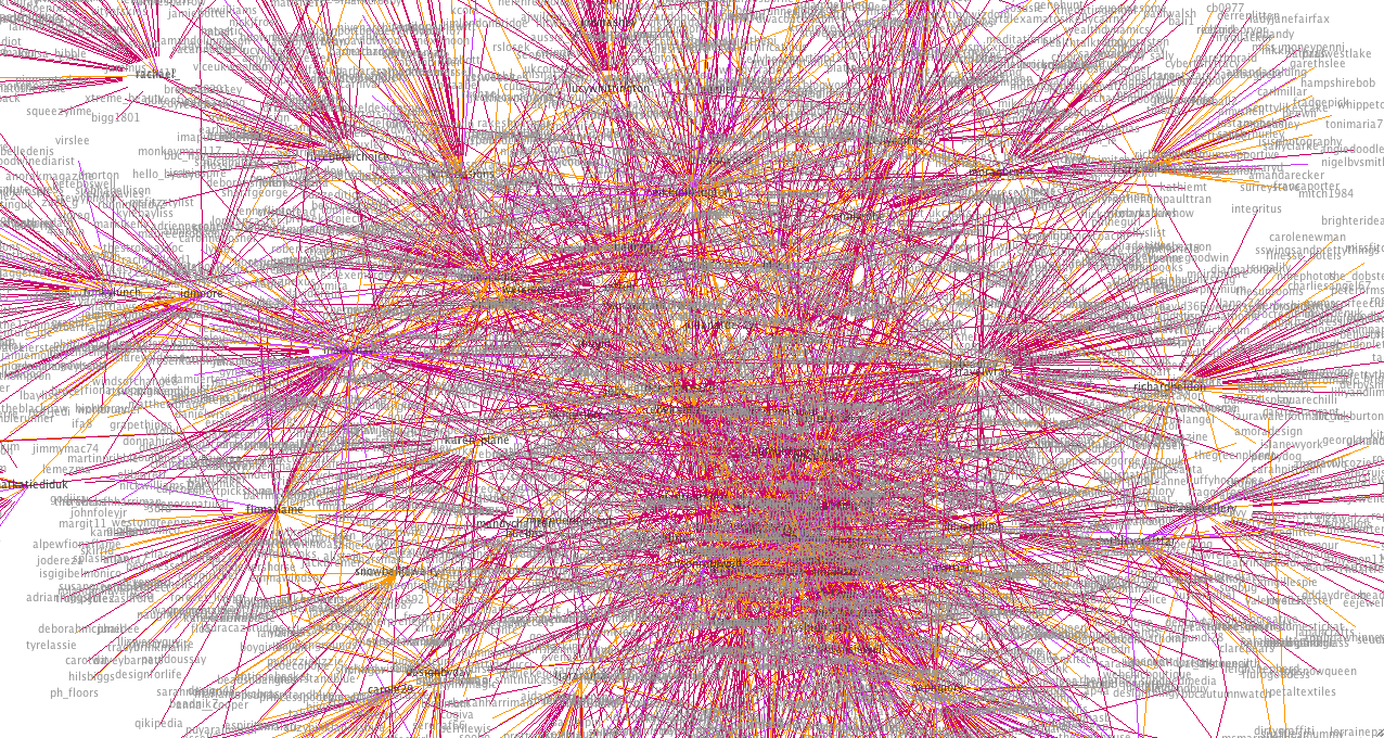
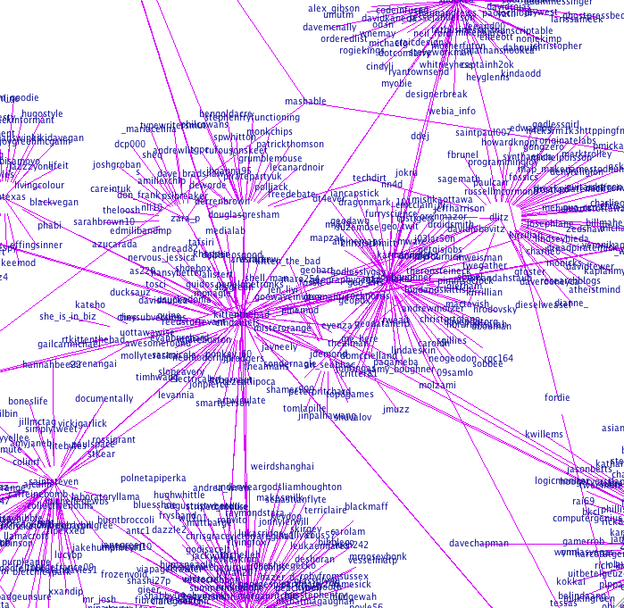
→: Visualizing your Twitter Conversations: RationaleI’ve frankly been amazed by the number of hits I’ve had on my Twitter Graphs since I put them up yesterday. This is the first phase of something I’m working on, so I’m going to write a little about the logic behind it here. Suggestions or thoughts are very welcome! There was a time when…
-
Twitter Graphs
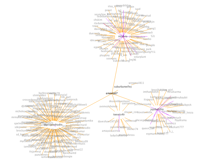
→: Twitter GraphsUPDATE 9/10: Insight into how this works and the rationale behind this in this post. So after my last post I received a couple of graph requests. Here’s @map_maker‘s, see how I’ve added the directionality. This one took a long time to build. She talks to a lot of people who talk to a lot…
-
Visualizing Your Twitter Network
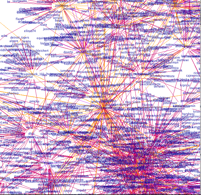
→: Visualizing Your Twitter NetworkThis is what I’ve been working on lately – it graphs who you’re having a conversation with on Twitter (and who they’re having a conversation with). I’ve got some more stuff to add to it, but I’m pretty happy with how little time this has taken (coding time, perhaps 10 hours?). There were 3 phases…
-
Information -> Data -> Meaning
→: Information -> Data -> MeaningClay Shirky wrote about this in Here Comes Everybody; the arrival of the printing press and how it changed everything. To summarize: when the printing press was invented the Church flipped out because they realized that they would no longer be in control of the information (namely, the Bible) that people had available to them.…