If you’re reading this on cate.blog, things look different. I’m pleased with how it came out. Getting there was more difficult than I expected.
I came into this confident. I used to work on WordPress (admittedly, the mobile apps – but I did the support rotations and lived in P2 like everyone else). I have been running my own site for years. This was not my first visual update, it was just the biggest. I thought my expertise + Claude design would be a winning combination.
It was not.
I knew what I wanted: a stronger brand, something more visually distinctive, an information architecture that put DRI front and centre, more of a “website” than “just a blog”
What went well
The design. Yes, it has the italicised titles characteristic of Claude design. But overall the look is a nice balance of pops of color but not in the way of reading. The goals have been met, and I’m really pleased with how it looks.
I love Claude Design, high on updating DRI Your Career I was looking for other things that could be prettier. I also used Claude Chrome to validate: visual detail at the level of font sizing and spacing is not a strength of mine, so it was incredibly useful to go through multiple rounds of checks and the entire site to ensure that everything had been applied just so.
What went poorly
TL;DR: WordPress.
I started using Claude Code as an issues manager and lookup engine, but after a day of this, frustrated by how much slower the progress was than I’d expected, I connected Claude Code directly. This was a huge accelerator, although I had to pay attention that it built block components rather than making everything custom – I do want to be able to edit it, after all. But even with that working, CSS edits still had to be copied and pasted.
I made a staging site, which I have never bothered to do before – probably something that had kept the scope of my previous redesigns small, ensuring that I could keep a working and visually acceptable website as I went.
I’d decided against a child theme, on the reasoning that child themes don’t receive updates and those are important. However because all the customisation lives as configuration in the database instead of in theme files, appearance and content are in the same place. Deploying staging to production took two hours, took my site down while it ran, and broke Jetpack on the way. I knew this going in (well not Jetpack breaking, that I had checked a box to prevent), when I set up the staging site, and decided to go with it. But it is still horrifying.
I moved from Twenty Twenty-Three to Twenty Twenty-Five, which is extremely minimal; very little is defined until you define it. As the definitions live in two places, Global Styles and a separate CSS block, any given margin might be set in either. Reconciling that was fiddly and irritating.
I always heard web developers be dismissive of WordPress, and I didn’t fully get it, because what I have always loved about it was that it was easy to write in, and that was my goal of having a website. But having dealt with this I get it. The tooling is just so frustrating.
Now that I have more of a brand, I decided to update What Raccoon to match – it’s more prominent on the site and felt jarring to switch, so wanted them aligned.
Yes, it’s a much smaller site. But it took 10 minutes and had one minor bug: keyboard detection in Chrome. Done.
cate.blog? Four days. Yes doing other things, but I maxed out my Pro plan twice in one day working on it. The last time I did that, I was making a 50 page slide deck (for the first time, inefficiently). My website is not that big. The difference in effort was wildly out of proportion to the difference in complexity. What’s interesting to me is the gap between where AI accelerates and where it doesn’t. WordPress – the speed increase did not match the increase in my ambition. But for a regular website? The speed increase is driving my ambition.
What I’d do differently
I did write GitHub issues, but they were the spec I handed Claude Code to work through, not a tracker I was keeping for myself. As things got more complex, I was missing one source of truth for me, across the three Claudes and all the manual steps in between, that stayed current as the work moved.
So, next time:
Treat it like a project for real: not just a spec to kick things off, but a source of truth I keep current as I go, so the plan and the actual state don’t drift apart.
Content backed up to GitHub so there’s real version control on it.
Still build the staging site to test against, but deploy by connecting Claude to the live site and having it move the changes across, rather than deal with deploying and all the problems that entailed.
A better way to keep Claude Design, Claude Code, and Chrome-for-validation in sync with each other. A validation checklist living in GitHub would go most of the way.
I’m keeping the new look, and I still have a deep love of Claude design. But my WordPress ambitions? Those will be tempered for a while.
At the end of 2017, after 3 years of nomadic life since leaving London, I moved to Ireland. I did this on the basis that I had to live somewhere, and in Ireland British people have the right to live independent of the EU – it was a safe haven from Brexit, which had left me determined not to return to the UK again – aka, Brexile.
Since rental yields in Ireland are amongst the highest in Europe, the sensible thing to do financially was to buy a property. On an emotional level, less sensibly, I wanted a really nice bathroom. Of course, with rental yields being so high, every habitable place I found I was in competition with investors – who thought nothing of outbidding me by €15K. After the devastation of finding the “perfect” place (two bedrooms, two bathrooms, in an apartment complex just across the river from the ~6 month rental I’d found on arrival) only to be dramatically outbid, I got real, defined my parameters, vowed not to get emotionally caught up in a place again, and accepted that the extent of the renovation work might be much more than “just” a bathroom.
Eventually, I found a place that fit my parameters. A 3 bed 1 bath townhouse in an apartment complex. There was parking, and it was empty and clean (unlike some places), but had had essentially nothing done to it since construction, well over 20 years prior. It was a shell.
I had planned to hire an interior designer, but after (also) being SOL there, I found a project manager, and set out to see what I was capable of on my own. My goal: the feminine smart home, modern, vibrant, but not overwhelming, everything with either purpose or beauty (but preferably both). At that point, I owned a desk, two exercise balls, and an assortment of art. I was really starting from scratch, and as my friend Camille said to me some time into this endeavor, I “really did go from zero to fully domesticated very quickly”.
To start with, the things you don’t see in the pictures. Every room has underfloor heating – so much better in the cold Irish winter. I was very intense about this, vowing that I would “be warm in February”, only to learn that not all Februaries are quite as cold as the only one I had then experienced. This means the radiators don’t have to be as big, and in practice I rarely turn them on. All lighting is Hue, so I can control the colors, and keep rooms warmly lit in the evening – which helps with sleep. There are Sonos speakers throughout the house, typically music is playing from the moment I wake up until I go to sleep. Similarly, there are 4 electronic diffusers and 3 reed diffusers throughout the house. As I set about creating each space, I asked, “how do I want to feel?”, and scent is an important part of that.
I thought about designing the house much like designing a user interface. Knowing my own limitations I eliminated texture – no wood – because it’s much harder to match and would make ensuing decisions more complicated. Instead I opted for the same base of mid-grey flooring and pale grey walls throughout, and then on top of that built out each room’s character. Whilst all the colors would be too much together in one space, they all work together, creating a sense of harmony and progression. In each room then, there were two decisions – accent wall color, and blind color. Much more manageable than creating every space from scratch.
Kitchen
I wanted the kitchen to feel vibrant and energizing, like a sunrise or a sunset. The pink wall and pink and orange blinds, coupled with a large flower arrangement on the kitchen island make this a space that I’m always happy to walk into. The pink shelf brings the pink from the opposite wall across the room, and the mirror creates more light and space. In this room, I opt for fresh and clean scents, like Eucalyptus or Tea Tree.
The kitchen is from Cash and Carry Kitchens, and was designed by Marie. I really like the white look, and it allowed me to buy high end white appliances and have them fit in, without dealing with the annoyance, flakiness, and limited selection of built in ones.
The love seat and counter stools are also from Harvey Norman.
The London pillows come from the Futon Company shop in Cambridge.
The purple patterned throw is from Ecuador, I bought it during the Feria de las Flores at the Jardín Botánico de Medellín (one of my favourite places in Medellín.
The art is mainly pieces I’ve collected on my travels, but several prints come from Wild Design.
The cityscape above the shelves is from Boston.
The four pictures next to it are scenes of NYC.
The small painting depicting Paris on the shelves is by Jean Pierre Weill, it’s built up on layers of glass.
I wanted the living room to feel relaxing and peaceful, like dusk. The blankets and the scent of lavender make this a cosy place to chill out at the end of the day.
Normal People are just People you Don’t Know Well Enough, I am pretty confident I got this in NYC, either at the Whitney or MoMA.
The vertical black picture is a tea towel from Japan.
I bought the big picture in the middle of the main wall from Perry St Cafe – they regularly rotate displays of local art.
The picture of the boats is by Christine Creagh from the Yellow Door Gallery in Baltimore.
The small blue picture on the far left is from an artist in Guatape, I found his gallery wandering around the town.
The left shelf: The brown container on the top I got in Fiji, the vase underneath it is by Diem Pottery from Kilkenny designs.
The right shelf: The bowl I bought at a store by the Museo de Arte Moderno de Medellín, the vase underneath I bought in Venice (that style can be found in many of the stores selling glass) and filled with regular fairy lights.
The sofa is from Harvey Norman, and the black patterned throw is from Equador, I bought it with the other one during the Feria de las Flores at the Jardín Botánico de Medellín.
The TV shelf is custom built for the TV (a 55″ Sony Bravia, also from Harvey Norman).
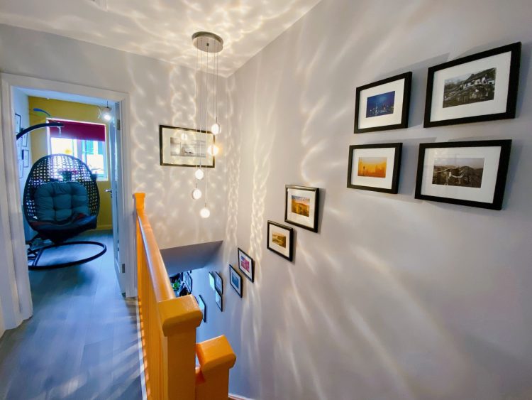
Hall
An early decision in the design of the house was to paint the staircase orange. There were various suggestions to carpet the stairs and make it a more neutral space (aka cheaper and unappealing), but I went fully the other way!
I wanted to create a connection between the kitchen and the hallway, and rather than let the hallway be bland and boring, create a light and beautiful space – this is particularly apparent at the top of the stairs, where the mirror, statement light fixture, and glass doors make what could be a small dark space feel light and spacious. It creates a lot of warmth and generally makes the house feel welcoming, especially when combined with fresh but neutral scent, such as fresh cotton.
The shoe rack is custom made.
The cogs I bought at the boat station on the way to MoNA in Tasmania.
The map of Ireland picture was a gift from my friend Sophie.
The picture of the woman above the shoe rack was a gift from my friend Rochelle.
The pink and yellow picture by the kitchen I bought in Montevideo, Uruguay.
New York pictures I bought from a vendor by the Highline in NYC.
Flower pictures (bottom of the stairs): bought on my adventures in Canada.
Beach pictures (near the top of the stairs): bought on my adventures in Bondi Beach in Sydney, Australia.
Pictures at the top of the stairs are from China, bought on my adventures.
Lighthouse picture, bought at Mizen Head in south west Cork.
Boat picture by the bathroom door is from the Framemaker in Cork.
The orange print on the top shelf was a gift from my former colleague Nick.
Light fixture is from Galaxy Lighting in Cork, I saw it and fell in love – I love the shadows it casts and the way it reflects in the mirror.
In my work on this renovation, my first stop was City Tiles and Bathrooms, where I told a lovely man named Barry that I was determined to have the bathroom of my dreams (modulo the depressingly small size of most European bathrooms). For me this meant: a rain shower and storage.
Note the little details in the shower – the shelf to put your leg when shaving, and the built in shelves. Finally! A shower with enough storage space for all my products without being messy. The cabinetry gives me space for all my beauty products, my beauty product stockpile, and even the storage of towels. Underfloor heating and a surprisingly powerful towel rack keep this room dry and warm all year round – even in February.
The light fixture conceals three Hue bulbs, which allow me to create the perfect evening lighting.
Office
I wanted my office to feel energizing and creative, but also cosy. As I was working from home even pre-pandemic, I wanted to create a space where I would be happy to spend every working day! I like to scent it with something energizing like orange or mint.
Despite the impression the pictures give (wide angle lense on the newer iPhones is amazing), this is the smallest room in the house, and given there was no way to make it feel bigger and spacious, it was unsuited to a minimalistic approach. Instead I went for a kind of creative clutter. I love this room, everywhere I look I find something to inspire me. The hanging egg chair gives me a space to relax during breaks in a long day.
Grey vase on the window sill, Paul Maloney from Kilkenny designs.
The owl fabric covering the black console table was a gift from Ellen.
The grey storage containers underneath are from Søstrene Grene.
The hanging egg chair (long time dream) was from Debenhams (garden furniture range, but who cares) and the blanket is from Kilkenny designs.
The desk is black glass and from Harvey Norman.
The mysterious machine taking up so much space under the shelves is a Glowforge.
The rug is from The Range (and yes, it is as soft and fluffy as it looks).
The pinhole photography prints are from an artist who only sells them Saturdays on the Highline in NYC.
The small green vase on the top shelf was bought on my adventures in North Korea.
The small picture on the top shelf is of Casa Mila in Barcelona, my favourite building in the world.
The owl picture on the top right was a gift from Emi.
The elephant, elephant vase and cat picture were all bought on my adventures in Thailand.
Guest room
I wanted to create a guest room that would feel like a beautiful sanctuary for anyone who came to stay in it, whilst also providing extra storage space that I desperately needed with the corner wardrobe and under bed storage. I believe the only scent for a bedroom is lavender.
The bed is from EZ Living, and features hydraulic storage (amazing).
The small purple vase on the left of my bed was my Grandmothers.
The picture over the bed is a Japanese tea towel.
The hanging is also one I bought in Japan.
All other pieces of art were picked up on my adventures.
My bedroom
The final room, my bedroom, which I wanted to be a space where I felt happy and inspired to wake up every morning. I painted the wall my favourite shade of pink, and filled it with items that I find beautiful – as well as the comfiest, cosiest bed linens I could find.
Bed (aside from size), closets and light fixture the same as the guest room.
The pillows are Makimoo bamboo pillows – lovely and soft and hold their shape really well.
The picture over the bed is called “Venice in Love”, by Jean Pierre Weill, I bought it in Tel Aviv, Israel.
The vertical pieces either side of the bed are Japanese tea towels.
The two pictures on the left at the foot of the bed I bought in China.
When I joined the mobile team at Automattic, we had one designer – Matt Miklic, who wrote about the explerience of leading that team. However one thing I was reminded of following some of the current discussions around product development is how we thought about and approached design at the centre of the team, and how we worked (and continue to work) to create a productive tension between design and development.
Product engineering teams rely on design to function and deliver. What you see when design is not present (or not delivering) is engineering being reactive and short term focused, or rabbit holing on large technical infrastructure projects. This is a common problem, especially as design has become a bigger focus and design organizations try to balance the integration in product teams with creating a community across designers within an organization. The alternative is designers isolated, reporting to someone who doesn’t really understand their work – not great either.
When design and development are both present we can move towards the productive tension of good decision making – the designer deeply understands and advocates for the user, the engineering lead understands the technical constraints. Together, they can agree a path forward that delivers the most user value over time, how best to test and iterate, what is required for V1 and what is required for “done”.
This requires that design has a seat at the table – the team leadership table, but also in every project. The designer needs to be present, integrated, and listened to. It’s easy for engineers to outnumber and overwhelm, which can make it harder for design to speak up.
But equally, there is no value to a perfectly designed thing that is never delivered (any more than there is to a unusable thing delivered very fast). The design has to be balanced with the technical work, the understanding of the components, the APIs that can mean seemingly small UI changes vary in time estimate between months and days. When I worked as an engineer on a deadline it was normal for me to go through the mocks with the designer, explain what was a component and what was not, offer alternatives and timeframes and let them decide what was shippable and what was an enhancement. It allowed us to deliver much faster, in a situation where we both understood – and agreed – on both what and why.
Matt and I muddled our way through creating this on one team, based on our own gut feelings, good (and bad!) experiences and a few examples. Then we set off to deliberately recreate it on another team. This really cemented it for me as a straightforward and workable model, but also highlighted the need for three things: staffing, focus, and competence.
Staffing: You can only take on the projects that you can staff, but if design is going to be this central to the team then design needs to be accepted as a limiting factor in what you can potentially take on. You can’t just allocate your projects and then divvy them up amongst designers and hope for the best – no-one delivers their best work when overloaded, and making design a bottleneck breaks trust, and leads back to the situation we started with – engineering working around them to deliver something (anything!). Navigating a really understaffed design team was an ongoing challenge for us, and heavily influenced what projects we could take on, and within those projects how we would approach things. If we couldn’t staff a designer at the start of a project (never ideal), what could engineering get ahead on? If we didn’t have enough designers for each projects what could we take on that did not require design?
Focus: Changing the way of working always requires a lot of focus, changing that way within some real constraints (such as understaffing) meant that we had to remain super focused and deliberate on the end goal. This requires a lead who is willing to say no, and being willing to disappoint people short term in order to be able to deliver a better experience overall. However it also required some pragmatism and balance, citing a far off ideal that is clearly infeasible any time soon just makes people impatient. To mitigate things like that, Matt allocated one day a week to doing trash pickup, so that little things weren’t kept waiting on design forever, but could keep moving forward.
Competence: This is not a statement on working with competent people in general (although like most people I much prefer that). But this model meant building leadership as a competence in designers, and user awareness as a competence in engineering. Both designers and engineers need to learn how to negotiate, and how to communicate pragmatically with one another.
The thing to remember is that a strong delivery team is cross functional, in a way that may or may not be reflected on the org chart. However when your teams differ from your org chart, the responsibility for developing and coaching needs to be super clear, along with the lines of accountability. For example, whilst onboarding a developer is primarily the responsibility of the engineering lead, onboarding a designer is a responsibility shared between the design lead and the engineering lead; it’s important that they support each other in that, and that the new designer knows who to go to for what.
So how do you create that productive tension? Some key points and milestones:
Get clear on the users your team serves – user research, data, insight from support all help here.
Define your team and design within it – make sure design has a leadership role.
Engineering needs to engage with design from the start, providing sensible information on what’s easy and what’s hard, and understanding the nature of early exploration – which needs to be nurtured, not shut down.
Make the space and relationships to have the conversations about goals and trade offs.
Integrate design into the process – engineering needs to keep design in the loop on progress, share builds, and shouldn’t make adjustments to the agreed design without discussion.
Ship together – it’s not just an engineering milestone, but an everyone milestone.
Involve design in post delivery analysis – what does the data say people are doing vs what we hoped? What do we need to adjust?
I’ve spent a lot of time over the last 18 months working with Matt on how engineering teams can work better with designers, and I wish I’d read this book earlier! It was really helpful for understanding the different kinds of designers and how designers can work together. It was also really helpful to understand how design can work in larger scale organizations and gave some helpful context for some changes we’ve been making internally.
One of the things I found really interesting about the model of the centralized design team is how it mirrors the centralized mobile team (which is what we have at Automattic), with similar pros and cons. I’ve been thinking for a while that for a centralized mobile team to work, the mobile team has to be great at collaborating with other teams. This book inspired some thinking around what that looks like.
As I read the book, however, I was wondering how this model worked with the way engineering teams are typically structured, so I was disappointed to see no practical suggestions there – but that being left as an open question.
I’d definitely say the book is worth reading though, if you have any interest in design at scale and organisational design in general (but particularly for design).
I put together this talk as part of Design+Exclusion. It’s about the ways in which women get told to be quiet, and some of the thought behind our approach to inclusivity with Technically Speaking.
This was a challenging talk to put together because part of it involved looking up some of the things people have said to me online that have not been so nice and talking about them. But I think it’s important to highlight the ways in which we get silenced – because it’s easy to ignore, and to surface the hard and continuous work that goes into creating space for under-indexed folk to speak up – because it’s easy to overlook.
Design is a skill you can learn, the same way development is a skill you can learn.
Design is not about making it look pretty, small percentage of it. About working out hierarchy, working out what is important.
Brainstorm what the user should be able to do.
Not “have analytics”
Instead “watch a video”
Order it, figure out what is most important. Useful later on in forming the importance in the UI.
Cut out features that you can leave out of v1 at least.
Study other apps. “Good artists copy and great artists steal”, “everything ia a remix” – Kirby Ferguson.
Idea that being creative means having original thoughts. We all sample consciously and unconsciously all the time.
Broaden the way you think about the problem. Most apps are just organising information in a structured way. Can pull from a wide range of apps.
iOS look almost exclusively designed by Apple. Android, almost exclusively apps designed by google. They know the platform best and have thought about it a lot.
Search is an interesting thing to study on iOS. Messages app has hidden search bar, have to scroll. Similar location in email but initially visible. App store and podcasts put search in the tab. Seems inconsistent, but with good reason. Depends on how central use case it is. Main task in app store, less common task in messages.
Reuse is good “things that look similar are similar and should behave in a similar way”.
One have a wireframe, can move to the computer. Like Sketch, more for app design. 35GBP one off purchase.
Not all of your design needs to be exciting. Some things should be functional above everything else.
Nothing is set in stone, everything is iterating the whole time.
Familiar button, because traced over a similar one. Means user are going to understand.
Prototype in keynote. has some great features, helping mock up transitions. Can export a mob, make the size the same as an iPhone screen, make a clickable PDF with clickable buttons. You can run it on your iPhone or iPad.
Keynote iOS is landscape only, need to do everything at 90 degrees. But worth it to get something you can give to people to play with.
Also, XCode. Exported central image and made it scrollable. Can look and see how it would behave.
Consider empty states. What happens when things (e.g. location) are turned off. For error states, look at what other people do. Important when things are going on that users don’t feel frustrated or lost.
Important to get feedback throughout the whole process. Beta testing. Not just about ironing out bugs, also about taking on user feedback, finding out what is confusing them, and being prepared to change stuff.
Valuable time to sort things out before launch. After launch, make sure you have a way for the user to send you feedback. Users invest in the product, make it easy for them to send you feedback. Inform what is important in the next phase of the app.
Process:
Brainstorm
Study and remix
Rough sketch
Mockups
Prototype
ITERATE
Principles:
Focus on structure
Sample and remix
Don’t be arrogant – don’t think you know better, listen to feedback. don’t have to implement everything but take it onboard and consider it.
Talk from Capital One on moving their 2,500 page site to be mobile optimised.
My Takeaway
They drove mobile traffic up from 4%, to 40% in a year. My main shock here was that anyone was seeing mobile traffic as low as 4% in mid-2013. Given general internet trends, mobile traffic much below 40% is a sign you are doing it wrong.
Notes
2,500 pages, 4,000 different types. No templates.
0.5 billion page views per month, 30-40 million hits.
Before April 2013, mobile traffic was less than 4%. Now, over 40%.
Knew they could do more quickly, with less effort. Wanted to do something new, and be ahead of the curve.
Why?
Better UX.
Content parity.
Single code/content.
Cheaper – one version.
Users: mobile users demanding. 96% of mobile traffic was hitting “view full site”.
2010 did a re-platforming. Reviewed inventories, UI patterns. Consistency was really bad. Opportunity to focus on incremental change, using a component model.
My birthday this week, which made me angsty. So many people remembered though which was really sweet. Hung out with friends, got in some reasonable gym time. Getting the pool to myself for a while on Saturday was a highlight of my week.
Not feeling very creative lately, I think it’s because I’ve reached this really boring part of The Project – substantially done, need to incorporate comments and edit etc. Hopefully a good break over the weekend and the bank holiday next week will help me push through this bit and make some progress.
Had a call to prep for a panel I’m going to be on at ModevUX, the other panellists seem really cool so that is exciting.
WORK
Tube strike sucked, although it did mean that I was finally shut away without distractions to make progress on this document that I’ve been trying to work on for a while. My team went out to celebrate a launch, which was cool, although otherwise it wasn’t a good week. Couple of disappointments.
Booked my flights for McLean and Seattle later this month.
Still working on An Absolute Deception (I never normally take this long to finish a novel, but I’ve read it before and I’m not getting into it), 4 Hour Body (still trying out the tips, currently on cold showers – fail! – and swimming more, which is great), and Manage Your Day To Day.
Went to see Dirty Rotten Scoundrels which was completely bizarre but funny. The portrayal of women was pretty terrible though, including French maid outfits with the back cut out of the skirt (tiny frilly yet insufficiently revealing of their underwear without this modification?) except for one awesome twist.
Went to see In the Making at the Design Museum, which was really cool. All every day items stopped partway through the process. The Paul Smith exhibit I found less compelling.
Sometimes I feel like we’re two aliens, from different planets with different languages, trying to communicate via Skype without electricity. Sigh.
I spent a few hours over the break reading the 40 Days of Dating project. Two designers, friends with opposite attitudes to (and problems in) relationships conduct an experiment in dating each other, for 40 days. The visuals are gorgeous, I can see it making a lovely coffee table book. It’s an interesting concept, applying constraints to life (as you do in design) and making art out of it, and is also a commentary on modern dating – the pressures we create for ourselves, the fears we have.
Every day, they fill out a questionnaire which includes the questions “what did you learn about yourself”, “what did you learn about [the other person]”. I love this. The day by day appreciation of growing closer to another human being, and the day by day realisations about one’s choices and behaviour, and how they effect relationships.
As the time goes on, both play out their fears and habits, but it seems like the strong friendship and the nature of the experiment forces them to continue to see the other person as a human. It’s so easy to objectify, dismiss the concerns and humanity of someone who upsets us, but they keep coming back to the friendship they have, the desire to preserve it, and the commitment to the experiment.
On commitment-phobia:
It makes me think of Dave, a former boss of mine I had right after high school. He eventually became an important mentor and a great friend. He has all these phrases he goes by, stuff like “dress for the job you want, not the job you have” and “never put your hands in your pockets, it’s a sign of laziness.” Anyway, one phrase he says that particularly rings a bell in this case is, “never say ‘I can’t.’” When will I stop saying ‘I can’t’ when it comes to relationships?
On Disneyland:
I have mixed feelings about this place. On the one hand, there is something fascinating about Disney World. There is a high level of detail to every aspect of the operation and the experience, from the hand painted signs and the technology behind the projections and holograms, to the large scale coordinated shows that happen like clockwork. Yet, as Prince Charming passed by us waving, and I watched the little children squeal in excitement, I couldn’t help but think there is something twisted about this place. This whole place just plants expectations in children’s minds that make them think they will grow up to meet the perfect person who will make all their dreams come true. While this kind of storybook love is a positive and a seemingly innocent notion, it’s nearly impossible to live up to.
It’s interesting to think about how this kind of true love is a relatively recent concept in human history. Marriage unions used to be treated in a much more practical manner, often as nothing more than a business arrangement between families. It was only in the last few hundred years that we saw this birth of romanticism throughout culture.
On love:
What does it even mean to love someone? It seems almost impossible to universally define such a complex state of mind since we all experience life so uniquely. I guess love is something you just have to experience and define for yourself. On a whole, I’ve experienced it as being committed to someone I am passionately interested in. Someone who helps me discover aspects of myself I didn’t see before and for whom I can do the same. Someone I trust, respect, and share experiences with. Someone I can be my kind of weird with.
I loved it. It’s realistic, but still heartwarming. Sweet without being saccharine. It reminded me of all the reasons why I can’t really be bothered dating right now, of why relationships I’ve had have failed, and yet also somehow also of the reasons why it is worth trying.
Cookie Consent
We use cookies to improve your experience on our site. By using our site, you consent to cookies.


 I read