Continued on from Part 2, I’m representing similar data in a different (less exciting) way.
Before, we looked at how the activity on the twitter streams was spread out over the day and by different types of interaction. Here, I’m using charts to show the breakdown for the day, by user. I’ve also created charts for each type – these are too busy to show much more than users who are way above average in a particular tweet type.
Like last time, something is either:
Directed
Not directed, but containing a mention
Contains a link, not an @ mention
None of the above.
I’m using the existing code I’ve built up – Apache POI to import and some custom data-structures.
Alex Howard
Alfred Hermida
Andrew Keen
Cody Brown
Dan Gillmor
Dave Winer
David Cohn
David Eaves
Directed Tweets: Starting With an @
Dr. Mark Drapeau
Howard Weaver
Jay Rosen
JD Lasica
Jeff Jarvis
Jennifer Preston
Kirk LaPointe
Mark Glaser
Matthew Ingram
Tweets That Do Not Contain an @ Mention Or A Link
Steve Buttry
Steve Outing
Steve Yelvington
Tweets That Contain A Link But No @ Mention
Tweets That Are Not Directed But Contain An @ Mention
Unfortunately, Excel will only plot 250 data points – how unreasonable! Luckily I love breaking Excel and coding something that will do what I want it to do and look prettier, so voila.
Color scheme:
Is directed at someone by starting with an @
Contains a mention (@) of someone else
Contains a link
Otherwise, the point for that tweet is light gray. Note this is done in the order above, so if 1 is true, then it doesn’t matter if both 2 and 3 are true or false – the tweet will be pink. If 2 is true, the tweet may or may not contain a link – it will still be purple.
Alex Howard
Alfred Hermida
Andrew Keen
Cody Brown
Dan Gillmor
Dave Winer
David Cohn
David Eaves
Dr Mark Drapeau
Howard Weaver
Jay Rosen
JD Lasica
Jeff Jarvis
Jennifer Preston
Kirk LaPoint
Mark Glaser
Matthew Ingram
Steve Buttry
Steve Outing
Steve Yelvington
I used the Processing core.jar library within Eclipse, along with the data-structures I created originally and the Apache POI code for extracting the data from Excel.
I’m enclosing the code below, with some comments:
This code will not compile even with the Processing core.jar library (requires data-structure code that I have not yet released).
There is a horrible hack for calculating the time passed since original date – if you’re doing anything more with time consider Joda Time instead.
The code is written to visualize this data and only this data. Whilst I may create a proper ScatterPlot class for Processing at some point, I’ll probably wait until Java 7 because without lambda functions it will require either a standard data format, or some kind of interface hack to create an adapter pattern. I don’t like either of these approaches.
Aside from this, if you have some other use for it feel free to ping me with questions!
package com.catehuston.caitlin.viz;

import java.io.IOException;
import java.util.Calendar;
import java.util.Date;

import com.catehuston.caitlin.datastructures.Tweet;
import com.catehuston.caitlin.datastructures.User;
import com.catehuston.caitlin.parse.UserList;

import processing.core.PApplet;

@SuppressWarnings("serial")
public class Scatterplot extends PApplet {

	private static final int w = 1260; // 1160 for graph
	private static final int h = 600; // 480 for graph

	// spacing at either side
	private static final int xmargin = 70;
	private static final int ymargin = 60;

	// axis length
	private static final int xlen = w-(xmargin*2);
	private static final int ylen = h-(ymargin*2);

	// increments for day, hour, minute
	private static final int di = xlen/58;
	private static final int hi = ylen/24;
	private static final double mi = hi/60d;

	// user we're graphing
	private int index = 5;
	private User user;

	// calendar for date comparison
	Calendar startDate;

	public void setup() {
		UserList ul;
		try {
			// generate user list from spreadsheet
			ul = new UserList("../data/data_june16_top20.xls");
		} catch (IOException e) {
			// TODO Auto-generated catch block
			e.printStackTrace();
			return;
		}

		// get data just for the user we're interested in
		user = ul.get(index);

		// set applet size
		size(w, h);

		// draw() method will be called only once
		noLoop();

		// set up calendar with base date
		startDate = Calendar.getInstance();
		startDate.set(Calendar.YEAR, 2010);
		startDate.set(Calendar.MONTH, Calendar.FEBRUARY);
		startDate.set(Calendar.DAY_OF_MONTH, 1);
		startDate.set(Calendar.HOUR_OF_DAY, 0);
		startDate.set(Calendar.MINUTE, 0);
	}

	public void draw() {
		// set background color - dark grey
		background(64);

		// set foreground color for text and axes - light grey
		stroke(238);
		fill(238);

		// draw user name string top left
		text(user.getUser(), 5, 15);

		// draw x-axis
		int ypos = ylen+ymargin;
		line(xmargin, ypos, xmargin + xlen, ypos);
		// add major markers

		// initial
		line(xmargin, ypos, xmargin, ypos+5);
		text("Feb 1, 2010", xmargin, ypos+20);

		// mid-feb
		int inc = 13*di;
		line(xmargin + inc, ypos, xmargin + inc, ypos+5);
		text("Feb 14, 2010", xmargin + inc, ypos+20);

		// start of march
		inc = 28*di;
		line(xmargin + inc, ypos, xmargin + inc, ypos+5);
		text("Mar 1, 2010", xmargin + inc, ypos+20);

		// mid march
		inc = inc + 14*di;
		line(xmargin + inc, ypos, xmargin + inc, ypos+5);
		text("Mar 15, 2010", xmargin + inc, ypos+20);

		// end of march
		inc = 58*di;
		line(xmargin + inc, ypos, xmargin + inc, ypos+5);
		text("Mar 31, 2010", xmargin + inc - 60, ypos+20);

		// draw y-axis
		line(xmargin, ymargin, xmargin, ypos);
		// add markers
		for (int i = 0; i < 2401; i+=200) {
			inc = i/100*hi;
			ypos = ymargin + ylen - inc;
			line(xmargin-5, ypos, xmargin, ypos);
			String hrs = i + "h";
			if (i == 0) {
				hrs = "0000h";
			}
			else if (i < 1000) {
				hrs = "0" + hrs;
			}
			text(hrs, xmargin-50, ypos+10);
		}

		// go through and plot points, color according to type
		for (Tweet t : user.getTweets()) {
			// set color according to tweet type
			// @ message
			if (t.isDirected()) {
				// pink
				stroke(236, 0, 128);
				fill(236, 0, 128);
			}
			// someone else is mentioned
			else if (t.isMention()) {
				// purple
				stroke(140, 9, 214);
				fill(140, 9, 214);
			}
			// contains link
			else if (t.hasLink()){
				// yellow
				stroke(255, 126, 0);
				fill(255, 126, 0);
			}
			// otherwise
			else {
				stroke(238);
				fill(238);
			}

			Date d = t.getDate();
			int x = getXPos(d);
			int y = getYPos(d);
			ellipse(x, y, 3, 3);
		}
	}

	private int getXPos(Date date) {
		// make calendar with specified date
		Calendar newDate = Calendar.getInstance();
		newDate.setTime(date);

		// count how many days we go back to find start date
		int count = -1;
		while(startDate.before(newDate)) {
			count++;
			newDate.add(Calendar.DATE, -1);
		}

		return xmargin + count * di;
	}

	private int getYPos(Date date) {
		// put date in calendar so we can manipulate it
		Calendar time = Calendar.getInstance();
		time.setTime(date);

		// work out hour increment
		int hrs = time.get(Calendar.HOUR_OF_DAY) * hi;
		// wor out minute increment
		double mins = time.get(Calendar.MINUTE) * mi;

		// return y value
		return (int) (ylen + ymargin - hrs - mins);
	}
}
My friend Caitlin is using Twitter to investigate the discourse around the future of newspapers. She has collected a bunch of data in a spreadsheet, and I get to visualize it – yay!
First up, extracting some general stats. I used the Apache POI to get the enormous speadsheet into Java (normally I would use Python for this kind of thing, but because I’ll use Java to visualize later I’m just doing it all in Java). POI made it super easy to do this, literally:
public static List extractTweets(String filename) throws IOException {
	InputStream inp = new FileInputStream(filename);
	HSSFWorkbook wb = new HSSFWorkbook(new POIFSFileSystem(inp));

	List tweets = new LinkedList();
	HSSFSheet sheet = wb.getSheetAt(0);
	for (int i = 0; i <= sheet.getLastRowNum(); i++) {
		HSSFRow row = sheet.getRow(i);
		String name = row.getCell(1).getStringCellValue();
		Date date = row.getCell(2).getDateCellValue();
		String tweet = row.getCell(4).toString();
		Tweet t = new Tweet(name, date, tweet);
		tweets.add(t);
	}

	return tweets;
}
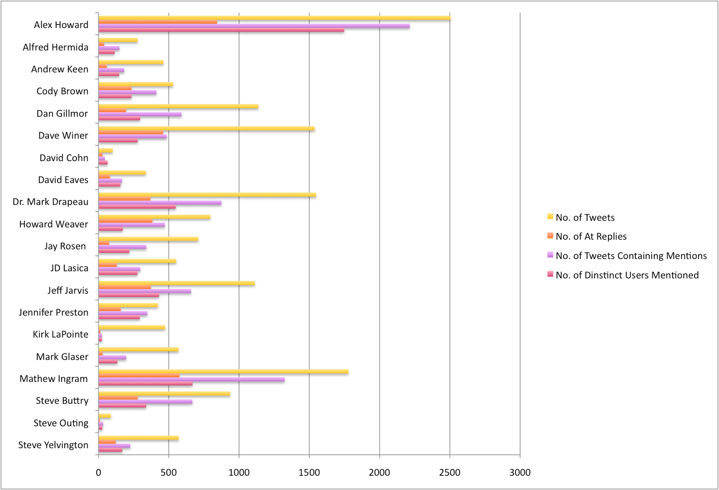
First up, I’ve extracted a couple of overview stats. Specifically: total number of tweets, number of tweets containing @ mentions, number of @ replies, number of distinct users mentioned. You can see what this looks like for the 20 people in the chart, below:
Last week, I read Coders at Work (Amazon, Google books). I really enjoyed it, it was fascinating and I learned a lot about the history of programming and the programmers themselves.
Progress isn’t always forward. Sometimes we’re leaping forward and sometimes we’re leaping backwards. When we leaped to the PC, we lost a whole lot of stuff. In the timesharing era, we had social systems online. A timesharing system was a marketplace. It was a community, and everyone who was part of that system could exchange email, they could exchange files, they could chat, they could play games. They were doing all that stuff and it got lost when we went to PCs. It took another 20 years or so to get that back.
Humans are social creatures. Social is normal. So the person pitching a website so: “<generic idea>, blah blah blah… but it will have this social network and that’ll be so awesome” – how different are they really from those people who used to pitch: “we’re going to have a business, we don’t know what it will do yet but it’ll be on the internet” back in the day.
Lately I’ve been thinking a lot about user’s mental models. For instance, for the “average user”, what does their mental model of the internet look like? How about their mental model of their social network?
For sophisticated users, the mental model explains to me why Facebook, LinkedIn, Twitter, and Foursquare can be completely complementary. LinkedIn is for professional contacts. Twitter is for people they want to share ideas with. FourSquare is for people they actually hang out with. Facebook is for everyone else (perhaps that is why power users have lately been finding Facebook so expendable?).
What about average users though? Do Facebook lists sufficiently enable the distinctions they have in their mental model? What do you think? It seems like they wouldn’t.
In the real world, people have different social networks. Some people work hard to keep their different networks separate, and may act differently depending on who they are with. Some people are consistent, and deliberately try to build links across networks. Most of us probably fall somewhere in between.
It used to be that you managed these networks from one phone – two at a push. That is less and less the case. Now we manage our networks through diverse means – multiple phones, multiple email addresses, multiple social networks, chat programs. I might make a plan with a friend on Facebook, confirm the day before by SMS, and know that they’ve arrived via Foursquare. Mentioning that we’re hanging out on Twitter or Facebook might mean that other people join us. It’s confusing.
Ages ago, I read a novel about a woman with commitment phobia who managed her cheating by having a different phone for each lover. Horrifying, right? Most of us would not want to live like that. And yet – right now it seems like I kind of do. I catch up with my work colleagues via Sametime, some friends via Facebook and some via Twitter. I email a couple of people. I chat with some friends via a AOL/MSN using Adium, and others on Skype. The other day I invited some people over, and I had no clue how many people were coming because I’d arranged it via so many different medium.
I think the future of “social” depends on our mental models of ourselves and our network. I was started to explore this in this post, and I’m increasingly fascinated by it. So I’m going to keep thinking – and let me know what you think, too.
Credit: flickr / kevindooley
Embedded below – really great slide deck with commentary which has given me a lot to think about in respect to this. I hope you enjoy it too!