Visualization
-

Pycon AU: Exploring Science on Twitter with IPython Notebook and Python Pandas
→: Pycon AU: Exploring Science on Twitter with IPython Notebook and Python PandasBrenda gave a great talk at Pycon-AU about using IPython and Pandas for her research. Slightly rough notes below. She has a dataset of 12 million tweets containing the word “science” – about a years worth of data, after filtering fout non-English tweets and spam. Using UTC for fewer timezone problems. Although still some – mostly…
-

Software Engineering for Superheros
→: Software Engineering for SuperherosI’m pretty sure I have the second best job in the world. My friend and I were talking the other week and the conclusion was that working on Google doodles would be the very best job in the world. I don’t know anything that makes so many people happy. Unfortunately, neither of us can draw.…
-
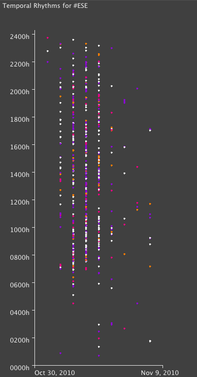
Exploring a Conference Hashtag: Part 3
→: Exploring a Conference Hashtag: Part 3I wanted to explore temporal rhythms around the conference, for example to pick out more popular or particularly tweet-able sessions. Color scheme: Is directed at someone by starting with an @ Contains a mention (@) of someone else Contains a link Disappointingly, no patterns are immediately obvious here – it seems like tweeting was reasonably consistent throughout. I…
-
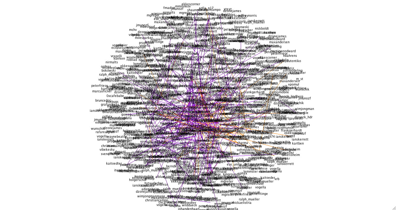
Part 8: Who’s Talking About The Future of Newspapers?
→: Part 8: Who’s Talking About The Future of Newspapers?I’m working on a paper on topical communities, and as part of that I’ve come back to this dataset to explore the social network that emerges through @ mentions. To start with, I looked at the social network that emerges when we look at the people on the list. This network is pretty densely connected,…
-

Sunflower Layout in Processing
→: Sunflower Layout in ProcessingFor a while, I’ve been wanting to make something that explores color in photo sets. Reading Beautiful Visualization (Amazon), I came across the perfect way to arrange the elements. It imitates the layout of the sunflower seeds, “the most efficient and visually mesmerizing way of packing small elements into a large circle”. I decided to…
-
Following the Conversation: A More Meaningful Measure of Engagement
→: Following the Conversation: A More Meaningful Measure of EngagementUnfortunately I can’t post the actual paper for a year, but hopefully the talk is going to be more interesting anyway! I used Google Docs to create my slides and you can find the deck here. Twitter: An Overview Who doesn’t use Twitter? Who doesn’t use Twitter because they think it’s pointless? Before I start,…
-
Exploring a Conference Hashtag: Part 2
→: Exploring a Conference Hashtag: Part 2Continued on from this post. Also see my supervisor’s comments. Interestingly, it turns out there is an Eclipse product called “Eclipse RT”, so perhaps there weren’t as many retweets as the wordle might have suggested… Still – 413 of the 640 tweets in the data set contained an @ mention of some kind. Of these,…
-
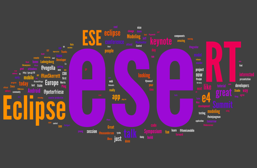
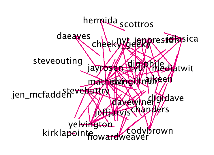
Exploring a Conference Hashtag
→: Exploring a Conference HashtagMy supervisor had the idea of grabbing a conference dataset by hashtag, specifically the Eclipse Conference 2010 (hashtag #ese) which took place in Ludwigsburg, Germany, November 2nd to November 4th. You can get an idea of what people were talking about in the wordle, below (applet is here): Apparently there were a lot of RT’s. We’ll…