Tag: twitter conversation graphs

  • Cliques

    If you’re not a computer scientist, probably you think of cliques like in the movie Mean Girls. A bunch of people who talk the same and look the same and act the same…

    Credit: flikr / Xpectro
    Credit: flikr / Xpectro

    To computer scientists (well, not all of them – I’m more inclined to think about Mean Girls to be honest) cliques are a part of graph theory. Essentially, it’s a group of nodes within a graph that are all connected to each other (Wikipedia).

    So what? Big who cares, right? Graph theory is super boring!

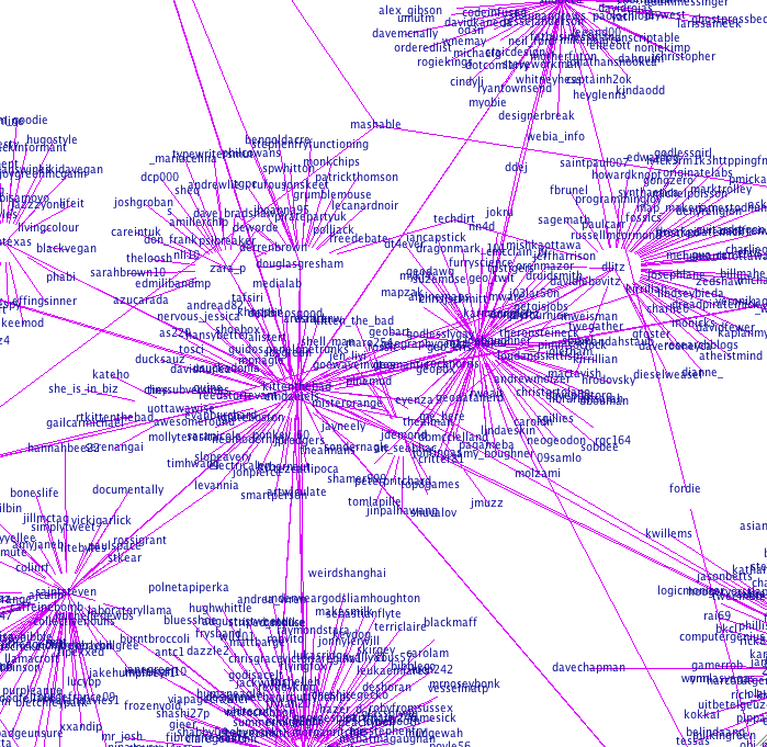
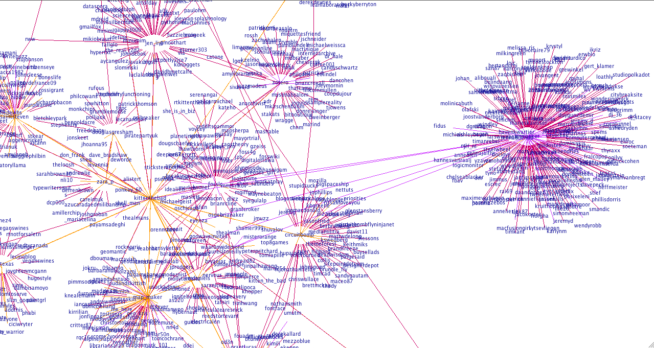
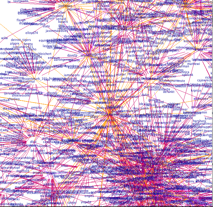
    I’m not big on the maths side of computer science, been there, got the t-shirt, and now I want to make stuff! But recently I’ve been working on applying graph theory to the Twitter Conversation Networks I make in order to produce my graphs. Why? Because this will allow me to pull out the sub-networks that you’re a part of, and the cliques that you’re connected to. Maybe if you know this you’ll find other people you’re potentially interested in following or (even better!) talking to.

    For instance, here are my cliques of size 4 (the maximum size of the cliques found) within my 2 degree network:

    [1,2,10,24]  – tgrevatt, kittenthebad (me), childspeter, isfalk

    [1,2,20,21] – tgrevatt, kittenthebad (me), mazamengr, krusk

    [1,2,21,24] – tgrevatt, kittenthebad (me), krusk, isfalk

    [1,21,24,74] – tgrevatt, krusk, isfalk, erinblaskie

    [1,21,24,85] – tgrevatt, krusk, isfalk, julien

    [1,20,21,74] – tgrevatt, mazamengr, krusk, erinblaskie

    [2,21,24,36] – kittenthebad (me), krusk, isfalk, foursquare

    There are more for size 3, but you get the picture.

    This is a step towards making simpler graphs, where I will graph only the cliques in someone’s network – this will make it easier to see your important connections, I think. For now, if you want one, you can have a mapping and the result of clique finding for a minimum size of 3 or more.

    How it’s done

    • I use the GraphML generated by my Twitter datamining library, that can also be used to produce visualizations.
    • A Python script generates a mapping and a list of connections
    • I implemented clique finding using Haskell – this means it runs really quickly and I don’t have to worry about memory because of lazy evaluation.
    • Minor optimization in the Haskell code, but significant due to the sparse nature of the graphs: I only try and find connections for nodes that have the minimum number of connections. Should be able to further optimize so that the same cliques aren’t found multiple times.
  • Visualizing your Twitter Conversations: Rationale

    Visualizing your Twitter Conversations: Rationale

    I’ve frankly been amazed by the number of hits I’ve had on my Twitter Graphs since I put them up yesterday. This is the first phase of something I’m working on, so I’m going to write a little about the logic behind it here. Suggestions or thoughts are very welcome!

    There was a time when follower counts meant something on Twitter. But that was probably before spammers, auto-follow (interesting article on how spammers and auto-follow have ruined the “social contract), and Robert Scoble‘s much hated “recommended list” (interesting post listing other people to follow who aren’t on the recommended list here). Now I think that looking at the number of people someone follows is a poor measure of their level of engagement with Twitter. Because I think a lot of what makes Twitter great is conversations it’s more interesting to me to measure those instead.

    To clarify – the graphs I’ve done have mostly gone to a depth of 1, which means that it graphs the central user (checks their last 200 tweets for people they’ve mentioned, and the last 100 tweets that have mentioned them), and then does the same thing for everyone they’ve mentioned or who has mentioned them, but goes no further (I am aware of the flaws in this, fix coming soon). This means that there could well be (and likely are) connections between second degree nodes from the center person, which aren’t shown. The application doesn’t use verification, so people with protected tweets will seem to have only one way relationships because any mentions they’ve made will not show up.

    Here’s my graph, below:

    @kittenthebad's Twitter Conversation Graph

    The yellow lines indicate a reciprocal relationship. Purple and red are one way relationships. It’s not always clear which direction it is in, but if you look at the “kittenthebad” node in the center, I mentioned “Zotero” (purple), but “unmasker” mentioned me (pink). If you look above to the left, you see my friends @zara_p and @douglasgresham and we have a little network going on there with a couple of other people we have in common. Below my node, you can see my friends @map_maker and @emdaniels and the people we have in common there too. So I think what my graph shows is that I’m primarily a conversationalist on Twitter and that most of the people I talk about, or to, I have a reciprocal relationship with. The other thing it shows, if you look at the number of people I’m following (57) is that the number of people I’m talking to is large relative to my network, about half.

    Now let’s take the last person who auto-followed me based on a keyword (lolcats), (please don’t click on this link if you’re easily offended) Trollcats . As of writing this, Trollcats has 2,660 following and 5,367 followers so you’d expect them to have a huge graph, right? See below:

    @Trollcats Twitter Conversation Graph

    Their network here is much smaller, they’re having fewer conversations and the people who they’re having conversations with mostly aren’t connected to one another. This suggests that they’re less engaged, and are using Twitter as more of a broadcast medium. However if they were getting ReTweeted a lot, their graph would look different. Remember @snookca (his graph is here). He has around twice as many followers, but his graph is exponentially more crazy – because he’s engaged with Twitter and having conversations.

    For a big broadcaster, see @guardiantech below – they’re not having a lot of conversations on Twitter but a lot of people are talking to or about them – likely they’re getting a lot more ReTweets:

    @guardiantech's Twitter Conversation Graph

    So why is this useful, or interesting? This is fairly new, so I can’t be sure yet but here’s what I think we’ll find. I think that graphs will be different, depending on how people use Twitter. Conversationalists, spammers, the uber-popular will have distinct patterns. I think that visualizing your network will show you sub-networks that may be surprising, and get a measure of how many sub-networks you’re a part of (the next step of this is – what are these subnetworks talking about?), and will also show which of your friends are “Twitter Connectors” (people who are in a lot of sub-networks). And I think as a result of this, visualizing someone who’s followed you will tell you a lot about whether you want to follow them back. Are they a spammer? Are they just broadcasting? How engaged are they relative to the number of people they’re following – if very, they’re likely following you because they want to strike up a conversation. If not much, they may just be following you in the hope you follow them back.

    This is written in Java and if you have some knowledge of programming and can run Eclipse it’s relatively easy to set up and run yourself. The source code is still being worked on, but I can make it available as-is to anyone who’s interested in running it.

  • Twitter Graphs

    Twitter Graphs

    UPDATE 9/10: Insight into how this works and the rationale behind this in this post.

    So after my last post I received a couple of graph requests.

    Here’s @map_maker‘s, see how I’ve added the directionality. This one took a long time to build. She talks to a lot of people who talk to a lot of people…

    @map_maker's Network
    @map_maker's Twitter Conversation Network

    And @emdaniels.

    @emdaniels Twitter Network Graph
    @emdaniels Twitter Conversation Network

    This is my boyfriends, @theAlMan. He doesn’t talk to that many people, so I dared to go to a depth of 2.

    @theAlMan
    @theAlMan's Twitter Conversation Network: Depth 2

    My very popular neighbor, @snookca (depth 1 again). He caused a stack overflow…

    @snookca's Graph
    @snookca's Twitter Conversation Network

    @Circuitbomb (depth 1).

    @Circuitbomb's Conversational Twitter Network
    @Circuitbomb's Twitter Conversation Network

    @uOttawaWISE – we’ve not been on Twitter long, but our network is growing! Also – because this one is fairly small you can see the connections really nicely.

    @uOttawaWISE Twitter Network Graph
    @uOttawaWISE Twitter Conversation Network

    @bitswt02

    @bitswt02's Twitter Conversation Network
    @bitswt02's Twitter Conversation Network

    @chrisboivin:

    @chrisboivin's Twitter Conversation Network
    @chrisboivin's Twitter Conversation Network

    @jaxama:

    jaxama
    @jaxama's Twitter Conversation Network

    @cheth (another one to cause a stack overflow!):

    @cheth's Twitter Conversation Network
    @cheth's Twitter Conversation Network

    @sparkyourart (another stack overflow!):

    @sparkyourart's Twitter Conversation Network
    @sparkyourart's Twitter Conversation Network

    Sorry for the delay – I’ve been tweaking my algorithm to produce more balanced graphs. It now takes your last 200 tweets and last 100 mentions (due to search limitations this means there will not be any older than a week) and finds the oldest ID in each set. Then it takes the maximum of these and ignores any tweets older than this ID. I’ve also added node distance coloring, so that the central node is darkest and nodes further from the central node are lighter.

    Here’s how my graph looks now (let me know what you think!):

    My Twitter Conversation Graph with distance coloring and algorithm modifications
    My Twitter Conversation Graph with distance coloring and algorithm modifications

    So, @velvetescape and @velvetconnect come next. After hitting the API limit a couple of times (even after I’d tweaked the algorithm – @velvetescape talks to and about a lot of people) I had to do these a little differently. For @velvetescape I changed the depth to 0 so it’s just him and the people he talks to and who talk about him. For someone with this much conversation going on, though, I think it shows it pretty nicely.

    @velvetescape's Twitter Conversations - Depth 0
    @velvetescape's Twitter Conversations – Depth 0

    For @velvetconnect I just changed the number of recent tweets I request from the API. Normally I get 200 most recent tweets and the last 100 (or week) of mentions but this just wasn’t feasible so I cut these both in half.

    @velvetconnect's Twitter Conversation Network (reduced data from API)
    @velvetconnect's Twitter Conversation Network (reduced data from API)

    @EarleyDaysYet:

    @EarleyDaysYet's Twitter Conversation Network
    @EarleyDaysYet's Twitter Conversation Network

    @jdemond‘s is below. This one is nice – you can really see he’s part of two distinct networks, and that the network to the right has some sub-networks going on.

    @jdemond's Twitter Conversation Networks
    @jdemond's Twitter Conversation Network

    @tipexxed:

    @tipexxed's Twitter Conversation Network
    @tipexxed's Twitter Conversation Network

    @boristopia:

    @boristopia's Twitter Conversation Network
    @boristopia's Twitter Conversation Network

    @CozyCabbage:

    @CozyCabbage's Twitter Conversation Network
    @CozyCabbage's Twitter Conversation Network

    @LALALAMBRIT:

    @LALALAMBRIT's Twitter Conversation Network
    @LALALAMBRIT's Twitter Conversation Network

    @wandywanz:

    @wandywanz Twitter Conversation Network
    @wandywanz Twitter Conversation Network

    @dlitz:

    @dlitz's Twitter Conversation Network
    @dlitz's Twitter Conversation Network

    @KristinaThorpe – this one was interesting! I didn’t hit the API limit but I did run into problems with the visualization engine that prevented it from rendering – not sure why, but I think it may be due to the graph being very densely connected. I reduced the API data by 25% (last 150 tweets, last 75 mentions) and that fixed it!

    @KristinaThorpe's Twitter Conversation Network
    @KristinaThorpe's Twitter Conversation Network

    Graphs continued on this page.

    If you want your graph done, let me know via Twitter or in the comments and I’ll put it up here for you. Feel free to use the image anywhere you’d like (ask me for a higher quality one if you need to), but please link back to this! Thanks 🙂

  • Visualizing Your Twitter Network

    Visualizing Your Twitter Network

    Visualizing your Twitter Network

    This is what I’ve been working on lately – it graphs who you’re having a conversation with on Twitter (and who they’re having a conversation with). I’ve got some more stuff to add to it, but I’m pretty happy with how little time this has taken (coding time, perhaps 10 hours?).

    There were 3 phases to this mini-project.

    Phase 1: API calls to Twitter to get the data. This tutorial and code sample was helpful, as was the Twitter API documentation.

    Phase 2: Converting to GraphML. Pretty easy once I’d read the GraphML Primer and with the use of the W3 Schools XML validation.

    Phase 3: Visualize. Something that Prefuse makes incredibly easy, this graph is a modification of their example.

    Next

    • It’s a directed graph, and I want to color-code the edges so that conversations going out are a different color from those going in (and different again from reciprocal relationships).
    • I need to balance the conversations, at the moment it takes your last 200 tweets and last 200 mentions which obviously potentially skews the graph in both directions depending on the user.
    • I want to be able to define the depth. I think a depth of 3 is practical, but as it grows exponentially probably not more than that.
    • Then I’ll be working to turn it into a web applet so you can see your graph, too.