Categories
management Organization

Org Survey Part 2: Analysis

This is the second part of running an org survey. You can find the questions in part 1. What Does The Data Look Like? First step is color-coding the spreadsheet to show trends in the numbers. I made a sample spreadsheet and generated random data – so it looks a little chaotic – but you […]

Categories
Thesis Twitter Visualization

Chart Showing Number of Cliques / Follower / Following

You can change around the axis etc however you like. Suggestion: Color: unique colors Size: Number of Cliques Y-axis: Followers X-axis: Following Now press the “play” button at the bottom left of the chart. You’ll see the bubbles change in size. I know it looks like a year, but it’s not – 1903 means number […]

Categories
Facebook Social Networking Visualization

TouchGraph

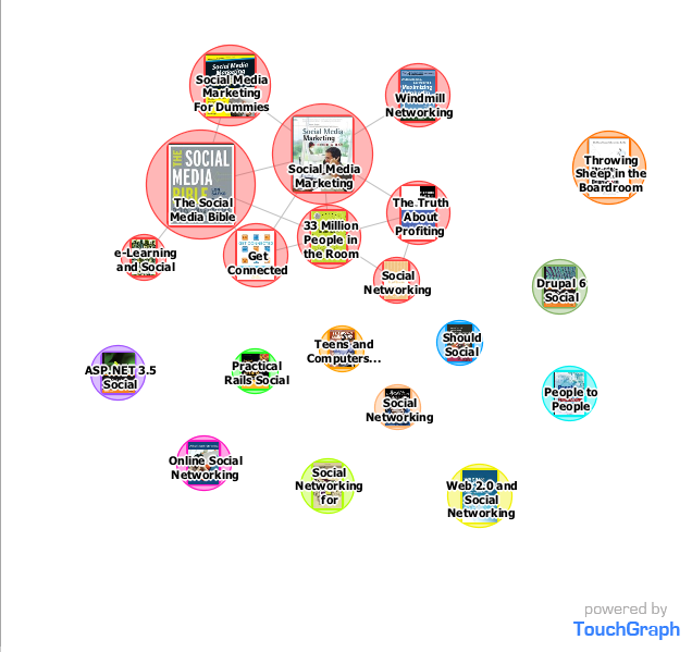
This is kinda awesome – check out the demos here. Screenshot for “Social Networking” from Amazon:   My Facebook network (zoomed out):   Zoomed in:   And finally, this adds a whole new dimension to Vanity Searching!            

Categories
Mycrocosm Reflections

Tracking Things

For a while now, I’ve been tracking something I’m describing “day in one word” on Mycrocosm. Thing is, by the end of each day I’m judging myself harshly and finding myself inadequate so looking at the data it seems I’m pretty miserable – and yet I think I’m fairly happy. After a good sleep, I […]

Categories
Mycrocosm Social Networking

Mycrocosm

Last month, I read a paper on Mycrocosm – briefly a site that facilitates “microblogging through stats”. So for the last month I’ve tracked everything I drank, see the graph linked below. Drinks So – big who cares? Well, I found it interesting! For instance, there was a big jump in liquid consumption when our […]